Cosmos design research
This is a measured design review of cosmos.so, captured on 21 November 2026 at a 1440 × 900 desktop viewport, with 390 × 844 mobile shots of four pages. Every value comes from getComputedStyle, the live CSS custom properties, or pixel crops of the captured screenshots. A value marked ≈ is an estimate.
Cosmos is a visual inspiration platform: a place to save, search and organise images, often called an ad-free Pinterest for designers. Its public site has four parts:
- Marketing home (
/): one long landing page.
- Explore and Shop (
/explore, /explore/shop): logged-out browsing of the product itself.
- Sequence (
/sequence/*): the weekly editorial newsletter. It is the blog.
- Utility pages: careers, legal, Public Work, a brand storefront, search results and the 404 page.
There is no changelog, pricing, about or press page. Public pages lists all 696 public URLs.
The design in one paragraph
Cosmos looks like a gallery wall, not a SaaS site. It uses one typeface, a custom cut of ABC Oracle called cosmosOracle, in near-black #0d0d0d on white and warm paper #f7f5f3. It has no brand colour; the only saturated colour is a pure electric blue #0700ff, used for sale prices and links. All the colour comes from the content: user images, brand photography and editorial portraits. The chrome is pills (Tailwind v4 rounded-full, which is calc(infinity * 1px) and computes to ≈3.36e7px), 12–20px card radii, 3px radii on raw images, and hairline 0.5px rings instead of borders. Motion is soft: 150ms colour changes, 300–400ms ease-out scales, blur-to-sharp entrances, a rotating hero headline with a 3D flip, and floating photo tiles drawn on a full-viewport <canvas>.
How to read this
| # |
Doc |
What it covers |
| 01 |
Design principles |
The 8 rules the site follows, and why |
| 02 |
Color system |
Full token set (light and dark), semantic roles, contrast ratios |
| 03 |
Typography |
cosmosOracle, basisMono, the type scale, tracking, where to get the fonts |
| 04 |
Layout, grid and spacing |
32px gutters, card sizes, section rhythm, reading columns |
| 05 |
Heroes |
The 7 hero patterns on the site |
| 06 |
Section types |
Every section block, including carousels, masonry, shelves and bento |
| 07 |
Copywriting and voice |
Headline formulas, microcopy, editorial voice |
| 08 |
Components |
Header, buttons, search pill, cards, tabs, footer |
| 09 |
Art direction |
Photography, collage, logos, the flower mark, wordmarks |
| 10 |
Brand assets and graphics |
An inventory of every graphic type, with crops and how to rebuild it |
| 11 |
Motion and interaction |
Keyframes, transitions, hover states, the hero rotation |
| 12 |
Glossary |
The terms to use when you brief this style |
| 13 |
Build recipe |
CSS tokens and component snippets you can paste |
Page reviews
Folder map
cosmos_design/
  README.md, public-pages.md, 01–13 system docs
  pages/            one doc per page or template
  images/full/      22 full-page 1440px screenshots
  images/<page>/    section crops per page
  images/assets/    35 component and graphic crops
  images/motion/    hero rotation frames and hover states
  images/responsive/ 390px mobile full pages
  data/<page>.json        DOM measurements (headings, text styles, colours, buttons, media)
  data/<page>.probe.json  fonts, @font-face, keyframes, transitions, radii, shadows, CSS variables
  data/tokens.json        the light/dark semantic token set
  data/public-pages.json  every public URL, grouped
What was not measured
- The canvas hero. The home hero's floating photo tiles are drawn on a 1440 × 900
<canvas>. Their physics (drift speed, rotation, depth blur) runs in JavaScript and cannot be read with CSS. Six frames in images/motion/ show the behaviour instead.
- Dark mode. The CSS ships a full dark token set (
--dark-*) behind prefers-color-scheme. The public pages still render light when the browser asks for dark, so dark mode appears to be in-app only. It is documented from the tokens, not from screenshots.
- The brand and search pages behind the wall. Logged-out visitors see a "Sign up to continue" modal after scrolling past about 2–3 screens. The brand and search captures stop before it.
- Mobile Explore. The 390px Explore capture shows grey placeholders because the masonry images lazy-load only while in view.
Public pages
Every public URL found on cosmos.so on 21 November 2026: 696 URLs.
Sources: robots.txt, /sitemap.xml (an index of /sitemaps/marketing.xml and /sitemaps/brands.xml), the header and footer, the Explore and Shop tab bars, and the help center home page.
- Cosmos has no blog, changelog, pricing, about or press page.
/changelog, /blog, /pricing, /about and /press all render the "Content not found" template (see the 404 page). Every unknown path is treated as a possible username, so the server returns 200 for all of them.
- Sequence is the editorial publication and plays the role of a blog. Editions are the weekly newsletter issues.
robots.txt blocks /api/, /studio/, /signup, /settings/, /account/, /external/ and every URL with a query string.- User profiles (
/<username>) and user collections (/<username>/<collection>) are public, but there are millions of them and no sitemap lists them, so they are not included here.
Core marketing
Explore categories
Shop categories
Sequence indexes
Sequence editions (38)
Sequence stories: interviews, object love, aesthetic studies (153)
Legal and contact
Help center (external)
Apps and social
Brand storefronts (452)
01 · Design principles
Cosmos sells taste. Its users are designers, stylists, art directors and students who curate images. The site is built so that the curated images are the brand, and the interface around them gets out of the way. Each rule below is measured from the site and has a reason behind it.
1. The content is the colour
What: Every interface colour is a neutral: #0d0d0d, #6e6a69, #9a9796, #d0cdcd, #f2f1f0, #f7f5f3, #ffffff. The only saturated UI colour is #0700ff (blue-600). It appears on 22 sale prices on /explore/shop and in the "Sale" tab.
Why: A curation tool has to show other people's palettes faithfully. A brand colour would compete with a butterfly photo on one tile and a red Balenciaga bag on the next. With neutral chrome, the photos supply all the colour, and each screen looks different every visit.
2. One typeface, many voices
What: All 22 captured pages use cosmosOracle for everything: the 88px SEQUENCE masthead, 48px article titles, 20px body text, 14px captions, and 15px buttons. Hierarchy comes from size (12–88px), weight (300–700) and grey value. A mono (basisMono) is loaded but no visible text on these pages uses it.
Why: A neutral grotesque that holds up at 88px and at 12px can carry both "product UI" and "magazine". One family keeps the editorial and product halves of the site feeling like one place.
3. Tight, negative tracking at every size
What: Body text is set at -2% tracking (-0.02em), display at -3% to -4%. Even 14px captions use -0.28px. Nothing on the site uses positive tracking or uppercase labels, apart from the SEQUENCE and COSMOS wordmarks, which are drawn caps.
Why: Tight tracking makes the grotesque look dense and "set", like a fashion or design magazine, rather than airy like a SaaS template.
4. Pills for actions, rounded cards for stories, sharp corners for raw images
What: There are three radius families:
| Element |
Radius |
| Buttons, inputs, chips, tabs |
full pill (calc(infinity*1px)) |
| Editorial and story cards |
20px outer card, 12px inner image |
| Feature-card media (home) |
12px; creator cards 16px |
| Raw saved images (Explore, search) |
3px |
| Product images (Shop, brand) |
4px |
Why: The radius tells you what kind of thing you are looking at. A 3px corner means "this is the original image, uncropped and un-styled", which is the point of a curation tool. Big soft radii mean "Cosmos packaged this for you". Pills mean "you can press this".
5. Rings, not borders; soft shadows, not depth
What: Cards use box-shadow: 0 0 0 0.5px rgb(13 13 13 / .12), a half-pixel ring, instead of a border. Elevated items (the QR card, the search pill) use stacked soft shadows with 0.02–0.1 opacity, plus an inset top highlight rgba(255,255,255,.7) 0 1px 1.5px inset.
Why: A half-pixel ring reads as a printed edge on retina screens and disappears on 1x. It keeps the page flat and paper-like. The inset highlight gives pills a subtle "pressed glass" feel without gloss.
6. Paper, not white, for reading
What: The editorial pages (/sequence/*, /careers, /legal/*) sit on a #f7f5f3 paper layer. The product pages (/explore, Shop, search) sit on pure #ffffff.
Why: Warm paper signals "slow down and read", like a magazine. Pure white is neutral, so it does not tint the user's images.
7. Motion that sharpens into place
What: Entrances use blur plus opacity (enter: opacity 0 + blur 2px → 1 + no blur; canvas-enter: blur 20px + scale 0.8 → sharp, 1.8s, cubic-bezier(.16,1,.3,1)). Hovers are 150ms colour shifts and 300–400ms scale-ups of 1.02.
Why: Blur-to-focus mimics a camera finding focus. It suits an image product and feels calmer than slide-ins.
8. Show the product logged-out, then gate it
What: Explore, Shop, brand pages, search results and every Sequence story are public. After about 2–3 screens of scrolling on brand and search pages, a "See more from …" sign-up modal appears over a blurred page.
Why: The product is its own best ad. The site lets search engines and visitors see real collections, then asks for an account at the moment of highest interest.
02 · Color system
Cosmos defines its colours as CSS custom properties: a raw palette (--color-gray-*, --color-blue-* …) plus semantic tokens with paired light and dark values (--light-text-primary / --dark-text-primary). The pairs are switched with Lightning CSS light-dark() output (var(--lightningcss-light, …) var(--lightningcss-dark, …)). The full list is in data/tokens.json and in the vars key of data/home.probe.json.
Computed colours come back from the browser in lab() and oklch(). The hex values below are converted with the D50 Lab → sRGB formula, and they match the hex values in the raw palette.
Neutrals (the whole UI)
| Token |
Hex |
Where it is used |
--color-gray-1000 |
#0d0d0d |
All primary text, primary buttons (Sign up, Follow, Subscribe), the 404 dots |
--color-gray-975 |
#141414 |
Dark-mode page background |
--color-gray-950 |
#212020 |
Dark-mode cards |
--color-gray-900 |
#323131 |
Dark-mode secondary buttons |
--color-gray-800 |
#434242 |
Image overlay base (--color-background-image-overlay) |
--color-warm-gray-light-600 |
#6e6a69 |
Secondary text: nav links, meta lines, descriptions, prices |
--color-warm-gray-light-400 |
#9a9796 |
Tertiary text: dates, search placeholder, footer links |
--color-gray-300 |
#d0cdcd |
Quaternary text: the inactive brand names on home (72px) |
--color-gray-100 |
#f2f1f0 |
Secondary buttons ("Explore Cosmos", "See all"), elevation |
--color-paper |
#f7f5f3 |
Editorial page background, home footer, header fade |
--color-gray-50 |
#fcfbfa |
Card hover fill (Sequence cards) |
--color-gray-0 |
#ffffff |
Page body, cards, inverted text |
The greys are warm: #6e6a69 and #9a9796 lean slightly red. The neutral palette (#757575, #919191) exists in the tokens but the text roles use the warm ramp. Warm greys sit better next to photography, which is mostly warm.
Accents (used sparingly)
| Token |
Hex |
Role |
--color-blue-600 |
#0700ff |
Light-mode link, accent button, badge, sale price |
--light-hover-accent |
#1f18fe |
Accent hover (dark: #1434e8) |
--dark-text-link |
#207aff |
Dark-mode link |
--color-orange-600 / -400 |
#bd3c1f / #ef7759 |
Critical (errors), light / dark |
--color-amber-600 / -400 |
#956400 / #cf9200 |
Warning |
--color-green-400 |
#00af5d |
Success text |
--color-pinterest |
#e60023 |
Import-from-Pinterest branding |
--color-tumblr |
#001935 |
Import-from-Tumblr branding |
#0700ff is almost pure RGB blue. It is a deliberate "web 1.0 hyperlink blue": raw and digital, so it reads as an interface signal and never as a decorative colour.
Semantic tokens (light → dark)
| Role |
Light |
Dark |
| text-primary |
#0d0d0d |
#ffffff |
| text-secondary |
#6e6a69 |
#aeabab |
| text-tertiary |
#9a9796 |
#918f8f |
| text-quaternary |
#d0cdcd |
#434242 |
| text-disabled |
#d0cdcd |
#3a3838 |
| button-primary |
#0d0d0d |
#ffffff |
| button-secondary |
#f2f1f0 |
#323131 |
| button-floating |
white 80% |
gray-700 30% |
| hover-primary |
#232323 (measured on Sign up hover) |
#e8e6e4 |
| hover-secondary |
#e8e6e4 (also the resting fill of the footer "Log in" button) |
#3e3d3d |
| hover-tertiary |
#f9f8f8 |
#181818 |
| button-accent |
#0700ff |
#1437ff |
| background-paper |
#f7f5f3 |
#141414 |
| background-primary |
#ffffff |
#141414 |
| background-elevation |
#f2f1f0 |
#323131 |
| background-floating |
white 80% |
gray-950 80% |
| background-toast |
white 75% |
gray-850 75% |
| border-primary |
gray-1000 at 12% |
paper at 12% |
| border-secondary |
gray-1000 at 10% |
white at 10% |
| border-active |
#0d0d0d |
#ffffff |
Dark mode is fully specified, but the public pages ignore it. With the browser emulating prefers-color-scheme: dark, /, /sequence and /explore still render body at #ffffff with #0d0d0d text (measured). Dark mode appears to apply only inside the logged-in app.
Overlays and gradients
| Use |
Value |
| Image dim on hover (Explore, search tiles) |
#0d0d0d at 40% (70 instances on /explore) |
| Header fade |
linear-gradient(#f7f5f3 0%, #f7f5f3 15%, rgb(247 245 243 / .92) 26%, …) down to transparent. It lets the sticky header sit on content without a solid bar. |
| Brand hero scrim |
linear-gradient(rgba(0,0,0,.47) 0%, transparent 81%) at the top, plus linear-gradient(transparent 45%, rgba(0,0,0,.3) 90%) at the bottom, so white text and the transparent header stay readable on photos |
| Search shell |
oklab(0.9586 …/0.9) ≈ #f2f1f0 at 90%, with an inset highlight |
| Tab underline glow |
linear-gradient(90deg, transparent calc(50% - 42px), #0d0d0d, transparent calc(50% + 42px)): a centred dark line that fades out at both ends under the active tab |
Image-derived colour
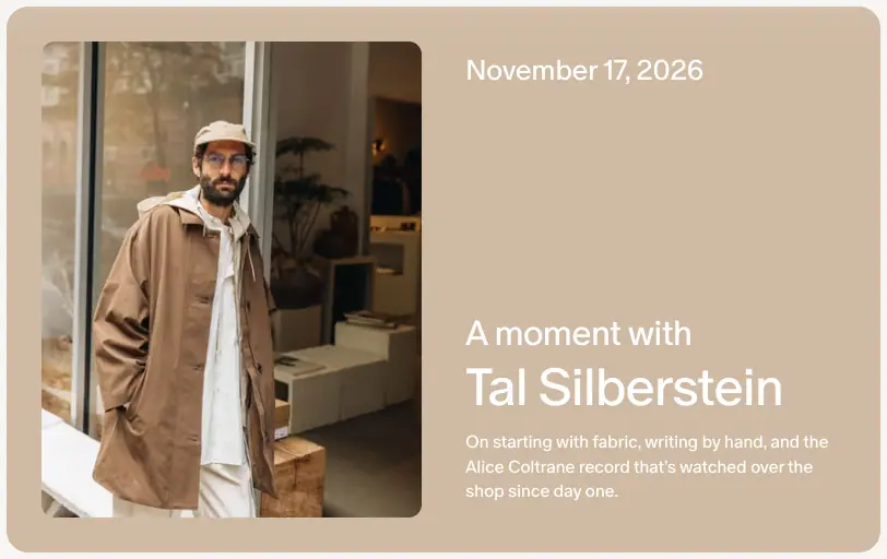
The Sequence interview hero card and the story cards take their background from the photo. For example, the Tal Silberstein card is rgb(207 186 163) ≈ #cfbaa3, sampled from the coat in the photo. The bg histograms in data/sequence.json list a different rgb() per card. This is the same idea as Apple Music's artwork tint: each story gets its own colour without a designer picking it.
Contrast (WCAG 2.x)
| Foreground |
Background |
Ratio |
Result |
#0d0d0d text |
#ffffff |
19.44:1 |
AAA |
#0d0d0d text |
#f7f5f3 paper |
17.87:1 |
AAA |
#0d0d0d text |
#f2f1f0 secondary button |
17.23:1 |
AAA |
#ffffff text |
#0d0d0d button |
19.44:1 |
AAA |
#ffffff text |
#232323 button hover |
15.72:1 |
AAA |
#6e6a69 secondary |
#ffffff |
5.35:1 |
AA |
#6e6a69 secondary |
#f7f5f3 |
4.92:1 |
AA |
#0700ff sale price |
#ffffff |
8.56:1 |
AAA |
#bd3c1f critical |
#ffffff |
5.48:1 |
AA |
#9a9796 tertiary (dates, footer) |
#ffffff |
2.90:1 |
Fails AA |
#9a9796 tertiary |
#f7f5f3 |
2.67:1 |
Fails AA |
#d0cdcd inactive brand names |
#ffffff |
1.58:1 |
Fails (72px, decorative state) |
#ffffff text |
#cfbaa3 tinted card |
1.87:1 |
Fails |
Reading this: Primary and secondary text pass with room to spare. Cosmos accepts failures in two places:
- Tertiary metadata (dates, footer links, the search placeholder) at 2.9:1. These are treated as "quiet" information.
- White text on image-tinted cards. When the sampled photo colour is light, as with the beige Tal Silberstein card, white text drops to 1.87:1. A safer version picks black or white text from the sampled colour's luminance.
03 · Typography
Families
| CSS family |
Files (from @font-face) |
Foundry / origin |
Weights declared |
Used for |
cosmosOracle |
cosmos_oracle_book, _regular, _medium, _bold, _heavy .woff2 |
A Cosmos-licensed cut of ABC Oracle by Dinamo (Basel/Berlin). The cosmos_ prefix suggests a custom build or naming for the licence. |
300 and 350 (both map to Book), 400, 500, 700, 900 |
Every visible string on every captured page |
basisMono |
basis_grotesque_pro_mono, _mono_italic, _mono_bold_italic .woff2 |
Basis Grotesque Pro Mono by Colophon Foundry |
400, 400 italic, 700 italic |
Declared and available as --font-basis-mono. No visible marketing text uses it, so it is likely used inside the app (colour codes, counts). |
Geist Mono |
variable 100–900 |
Vercel, free (SIL OFL) |
100–900 |
Loaded by a component (the --dial-* debug panel tokens). Not used on public pages. |
The fallback for both custom families is local("Arial") with metric overrides, named "cosmosOracle Fallback". That is the Next.js next/font pattern: it adjusts Arial's metrics so text does not jump when the web font loads.
document.fonts on home reports cosmosOracle 400, 500 and 700 as loaded; 300, 350 and 900 are declared but never requested. The body uses -webkit-font-smoothing: antialiased, 16px, #0d0d0d, no font-feature-settings.
Getting the fonts
- ABC Oracle: buy a licence at abcdinamo.com (desktop and web licences are sold separately; a trial is available).
- Basis Grotesque Mono: buy at colophon-foundry.org.
- Free substitutes:
| Original |
Free substitute |
Notes |
| ABC Oracle |
Geist (Vercel, OFL) or Inter Display / Inter Tight (OFL) |
Set both with tracking from -2% to -4%, as Cosmos does. Geist is closest in colour on screen. |
| Basis Grotesque Mono |
Geist Mono (OFL) or JetBrains Mono |
Cosmos already loads Geist Mono. |
The type scale (as declared)
Cosmos uses Tailwind v4 --text-* tokens, each with its own line height and letter spacing:
| Token |
Size |
Line height |
Tracking |
display-xxlarge |
4.5rem / 72px |
0.8 |
-3% |
display-large |
3rem / 48px |
1 |
-3% |
heading-xxlarge |
3rem / 48px |
1.1 |
-4% |
heading-xlarge |
2.25rem / 36px |
2.25rem |
-1% |
display |
2rem / 32px |
1.1 |
-3% |
heading-large |
1.625rem / 26px |
1.15 |
-2% |
heading / heading-medium |
1.25rem / 20px |
1.15 |
-2% |
body-large |
1rem |
1.5 |
-2% |
body |
1rem / 16px |
1.4 |
-2% |
body-medium |
0.9375rem / 15px |
1.375rem |
-1.875% |
body-small / body-regular |
0.875rem / 14px |
1.4 / 1.43 |
-2% |
button-medium |
15px |
18px |
-2% |
button-small |
12px |
18px |
-2% |
caption |
0.75rem / 12px |
1.17 |
-2% |
numerical |
0.625rem / 10px |
1.15 |
-1% |
Weights are named tokens too: light 300, book 350, normal 400, medium 500, bold 700.
The type scale (as measured on the pages)
| Role |
Example |
Size / line height |
Weight |
Tracking |
Colour |
| Masthead |
SEQUENCE (H1, /sequence) |
88 / 132px |
700 |
-4.4px (-5%) |
#0d0d0d |
| Hero display |
"Find your next / dream font" (H1, home) |
72 / 72px, second line 72 / 57.6px |
700 |
-2.88px (-4%) |
#0d0d0d |
| Closing display |
"Discover what's next" (footer, home) |
72 / 72px |
700 |
-2.88px |
#0d0d0d |
| Brand list |
"Paloma Wool", "Khaite" … |
72 / 72px |
700 |
-3% |
active #0d0d0d, rest #d0cdcd |
| Index title |
"Editions", "Interviews", "Object Love" |
72 / 72px |
500 |
-3% |
#0d0d0d |
| Featured edition |
"Can a UFO double-park outside Sweetgreen?" |
72 / 57.6px |
500 |
-3% |
white on photo |
| Section title (home) |
"Build your world, your way" |
48 / 48px |
500 |
-1.92px (-4%) |
#0d0d0d |
| Article title |
"Sundae Set", "Can a UFO …" (a <p>, not an <h1>) |
48 / 48px |
700 |
-3% |
#0d0d0d |
| Interview name on card |
"Marcus Milione" |
48 / 52.8px |
500 |
-1.92px |
#0d0d0d |
| Interview name on tinted card |
"Tal Silberstein" |
48 / 48px |
400 |
-3% |
white |
| Page title (utility) |
"Terms & Conditions", "Come build a space to dream" |
48 / 48px or 45.6px |
400 |
-3% / -1.92px |
#0d0d0d |
| CTA statement |
"Sequence is read by 4 million creatives every week" |
48 / 48px |
500 |
-3% |
#0d0d0d |
| Edition section head |
"Internet Microdoses" |
32 / 35.2px |
700 |
-0.64px (-2%) |
#0d0d0d |
| Sequence row title |
"This week in Sequence", "Interviews" |
32 / 35.2px |
500 |
-3% |
#0d0d0d |
| Card title |
"Sundae Set", "Do you want a slide in your office?" |
26 / 29.9px |
500 |
-2% |
#0d0d0d |
| Feature card title (home) |
"Search by color" |
26 / 29.9px |
500 |
-1.04px (-4%) |
#0d0d0d |
| Lead / statement |
"Cosmos is where the world's best taste comes to light." |
26 / 29.9px |
400 |
-2% |
#0d0d0d |
| Meta line |
"November 17, 2026 · Edition 56" |
20 / 23px |
500 |
-2% |
#6e6a69 |
| Section label (product) |
"Selected by Cosmos", "Featured brands" |
20 / 23px |
400 |
-2% |
#0d0d0d |
| Article body |
Sequence stories |
20 / 32px |
400; run-in lead 700 |
-0.4px (-2%) |
#0d0d0d |
| Article link |
"Stand up for cinema →" |
20 / 32px |
400 |
-0.4px |
#6e6a69 |
| Body |
card descriptions, careers lists |
16 / 22.4px |
400 |
-2% |
#0d0d0d or #6e6a69 |
| Legal body |
Terms |
16 / 24px |
350 (Book) |
-0.32px |
#0d0d0d |
| Legal clause head |
"1. Agreement to Terms" |
20 / 23px |
600 |
-0.4px |
#0d0d0d |
| Search placeholder |
"Search for typefaces" |
20 / 23px |
400 |
-2% |
#9a9796, typed part #0d0d0d |
| Nav link |
Explore, Sequence, Shop |
15 / 22px |
500 |
-0.28px |
#6e6a69 → #0d0d0d |
| Button |
Sign up, Log in |
15px, 48px tall |
500 |
-0.28px |
— |
| Big button |
Join Cosmos for free |
16px, 56px tall |
700 |
-0.32px |
— |
| Small button |
Follow, See all, Home |
14px, 40px tall |
500 |
-2% |
— |
| Caption / date |
"November 10, 2026", "@shop · 132 elements" |
14 / 19.6px |
400 |
-2% |
#9a9796 |
| Footer link |
Instagram, Terms |
14 / 20px |
500 |
-0.28px |
#9a9796 |
| Image credit |
"Verner Panton's …" |
12 / 28px |
400 |
-2% |
#6e6a69 |
| Micro badge |
"AI" |
12 / 14px |
500 |
-2% |
white |
Patterns worth copying
- Weight carries the voice. The Sequence index titles ("Editions") are 72px at weight 500, while the home hero is 72px at 700. Editorial reads calmer; marketing reads louder. Interview names on tinted cards drop to 400, which makes them feel like a magazine cover line.
- Display line height below 1. The hero second line uses
line-height: 0.8 (57.6px on 72px). Lines almost touch, which gives a poster feel.
- A 20/32 reading size. Article body is 20px on a 32px line, a 1.6 ratio, in a 620px column. That is about 60–65 characters per line, which is book-like and generous.
- Run-in bold leads. Each Edition item starts with a bold sentence, then continues in regular weight in the same paragraph: "TikTok-style videos are getting their own film fest. Microdramas are …". This is the newsletter "microdose" format.
- Book weight for legal. Terms use 350 rather than 400. Long grey-feeling text becomes lighter and less intimidating.
- Grey ramp for hierarchy. Title
#0d0d0d → description #6e6a69 → date #9a9796. Three steps and no other colour.

Mobile (390px)
| Element |
Desktop |
Mobile |
| Home hero H1 |
72 / 72 |
32 / 32 |
| Home section H2 |
48 / 48 |
32 / 32 |
| Home footer statement |
72 / 72 |
48 / 48 |
SEQUENCE masthead |
88 / 132 |
56.55 / 84.8 (clamp-style fluid size) |
| Sequence row titles |
32 / 35.2 |
26 / 29.9 |
| Interview article title |
48 / 48 |
48 / 48 (unchanged) |
The hero shrinks by more than half, but the article title stays at 48px. On a phone the story title is the hero.

Semantic note
Article titles are <p> elements, and some post pages have no <h1> at all (/sequence/editions/can-a-ufo-… has only H3 and H2 in the outline). The visual hierarchy is clear, but the document outline is not. If you copy the look, use a real <h1>.
04 · Layout, grid and spacing
Frame
| Measure |
Value |
Source |
| Viewport used |
1440 × 900 |
capture setting |
| Page side gutter |
32px |
H2 and card x = 32 on home, Sequence, Editions, Explore |
| Content width |
1376px (1440 − 2 × 32) |
Sequence row: 676 + 24 + 326 + 24 + 326 = 1376 |
| Header height |
92px, position: sticky, z-index: 200, transparent |
data/*.probe.json → nav |
| Spacing unit |
--spacing: .25rem (4px, Tailwind v4 default) |
tokens |
| Hero height (home) |
900px: exactly one viewport |
full-page crop |
| Home hero content block |
1200px wide, padding: 80px 0 |
h1 width 1200, parent block 1200 × 514 |
The layout uses no centred 1200px container, except for the hero text. Content runs edge to edge inside a 32px gutter, like a gallery wall or an Are.na channel. Reading pages switch to narrow centred columns.
Column systems
| Grid |
Column / item |
Gap |
Used on |
| 5-column image grid |
image 248px wide, column pitch ≈281.5px (x = 33, 315, 596, 878, 1159) |
≈33.5px |
Explore masonry, Shop shelves, brand storefront, search results |
| 4-column story grid |
card 326px |
24px |
Sequence home rows, Object Love, Aesthetic Studies |
| 2-up feature card |
676px (2 columns + gutter) |
24px |
Sequence "This week" lead card, Interviews index |
| 3-column edition grid |
443px tile |
24px (32 → 499 → 965) |
Editions index |
| Horizontal carousel |
384px feature cards, 224px creator cards |
24px |
Home "Build your world", "Find what others are saving" |
| Full-bleed feature |
1376 × 480 |
— |
Featured edition on Editions |
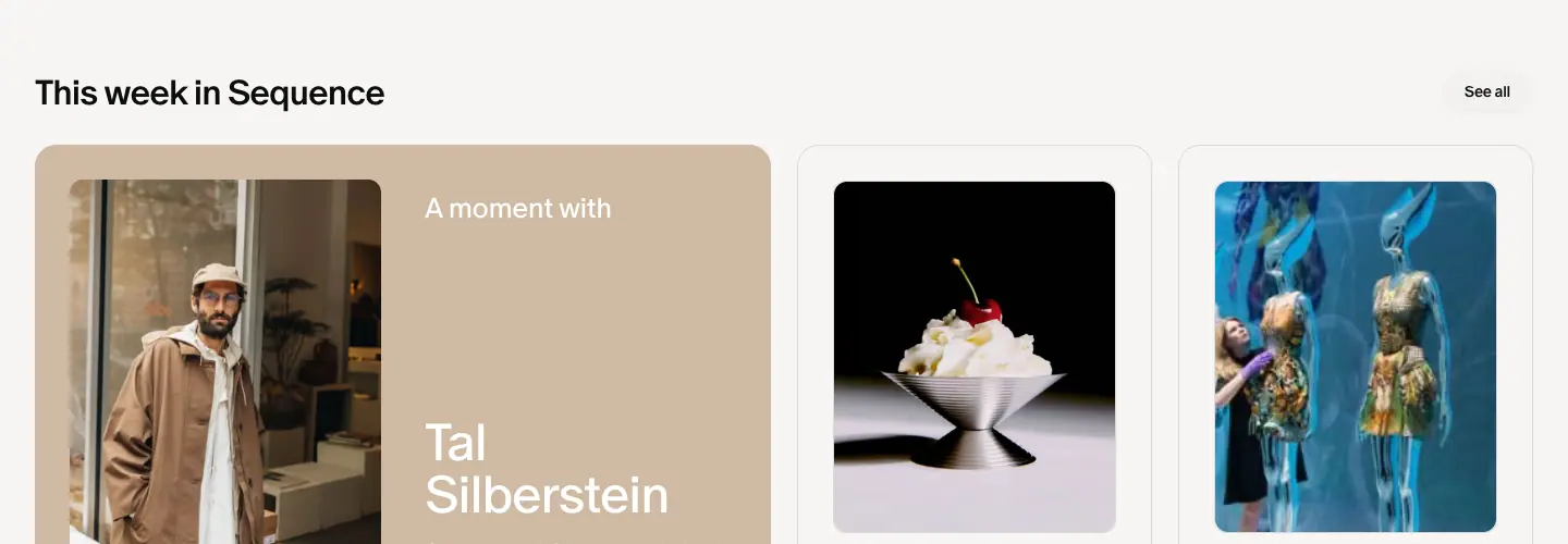
Story cards hold an inset image: the card is 326px wide with a 258px image centred inside it (34px side padding). On the Interviews index, the 676px card holds a 283px portrait on the left and text on the right. The padding makes the card read as a printed mat around a photo.
Reading columns
| Page type |
Column width |
x offset (centred) |
| Sequence article body |
620px |
410 |
| Interview hero card |
800px |
320 |
| Newsletter CTA block |
800px |
320 |
| Legal text, careers text |
720px |
360 |
| Careers headline block |
≈595px |
422 |
At 20px with -2% tracking, 620px holds about 60–65 characters per line.
Vertical rhythm (home, measured)
| From |
To |
Gap |
| Hero bottom (900) |
"Build your world" H2 top (1028) |
128px |
| H2 bottom (1076) |
Card row top (1108) |
32px |
| Card text bottom (≈1572) |
"Shop from brands like" H2 (1700) |
128px |
| Brand list rows |
1772 → 1852 → 1932 … |
80px pitch (72px type + 8px) |
| "Find what others are saving" H2 (2460, 2 lines) |
Creator cards (2604) |
≈48px |
| Creator cards bottom (2876) |
Logo-wall caption (2968) |
≈92px |
| Logo wall bottom (3143) |
Footer top (3223) |
80px |
| Footer |
#f7f5f3, padding: 80px 72px, no radius |
— |
The rule: 128px between sections, 32px from a section title to its content, 24px between cards.
Sequence rhythm
| Element |
Value |
Masthead SEQUENCE top |
124px (just under the 92px header) |
| Row title → cards |
≈66px from the title top (547 → 613) |
| Row to row |
≈633px pitch (title 547 → next title ≈1180) |
| Card radius / image radius |
20px / 12px |
| Card ring |
0 0 0 0.5px rgb(13 13 13 / .12) |
Radius scale
| Token |
Value |
Use |
| full pill |
calc(infinity * 1px) |
buttons, inputs, tabs, chips |
--radius-3xl |
24px (top corners only, 24px 24px 0 0) |
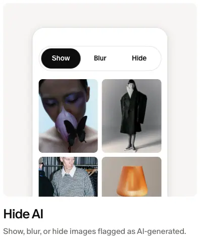
the phone mock-up inside the "Hide AI" feature card |
| 20px |
— |
story cards |
--radius-2xl |
16px |
creator cards, the tilted thumbnail chips in the hero headline |
--radius-xl |
12px |
home feature-card media (a 384 × 384 #f7f5f3 tile holding a looping video), images inside story cards, edition tiles |
--radius-lg / --radius-element |
8px |
small media in article bodies |
| 4px |
— |
product images |
| 3px |
— |
saved images in the 5-column grid |
| 25% |
— |
the QR card (a squircle-like shape that scales with its size) |
Breakpoints
The probe found these media queries: (min-width: 768px), (max-width: 720px), (hover: none) and (pointer: coarse), (prefers-reduced-motion: reduce), (prefers-color-scheme: light). At 390px:
- The gutter stays 16px ≈ (estimate from the mobile screenshot: content starts ≈16px from the edge).
- Carousels stay horizontal and show one card plus a peek of the next.
- The Sequence rows become single-card carousels with "See all".
- The header becomes COSMOS + a "Download" pill + a menu icon.
- The home CTA changes from "Join Cosmos for free" to "Download app" with an Apple logo. On a phone, the app is the conversion goal.

05 · Heroes
Cosmos uses seven hero patterns. The marketing home has one big, animated hero. Every other page starts with a small, quiet header and puts content within the first 400px. The product pages (Explore, Shop, search) have no hero at all.
1. Canvas cloud + rotating headline (home)
| Part |
Measured |
| Height |
900px (one viewport) |
| Background |
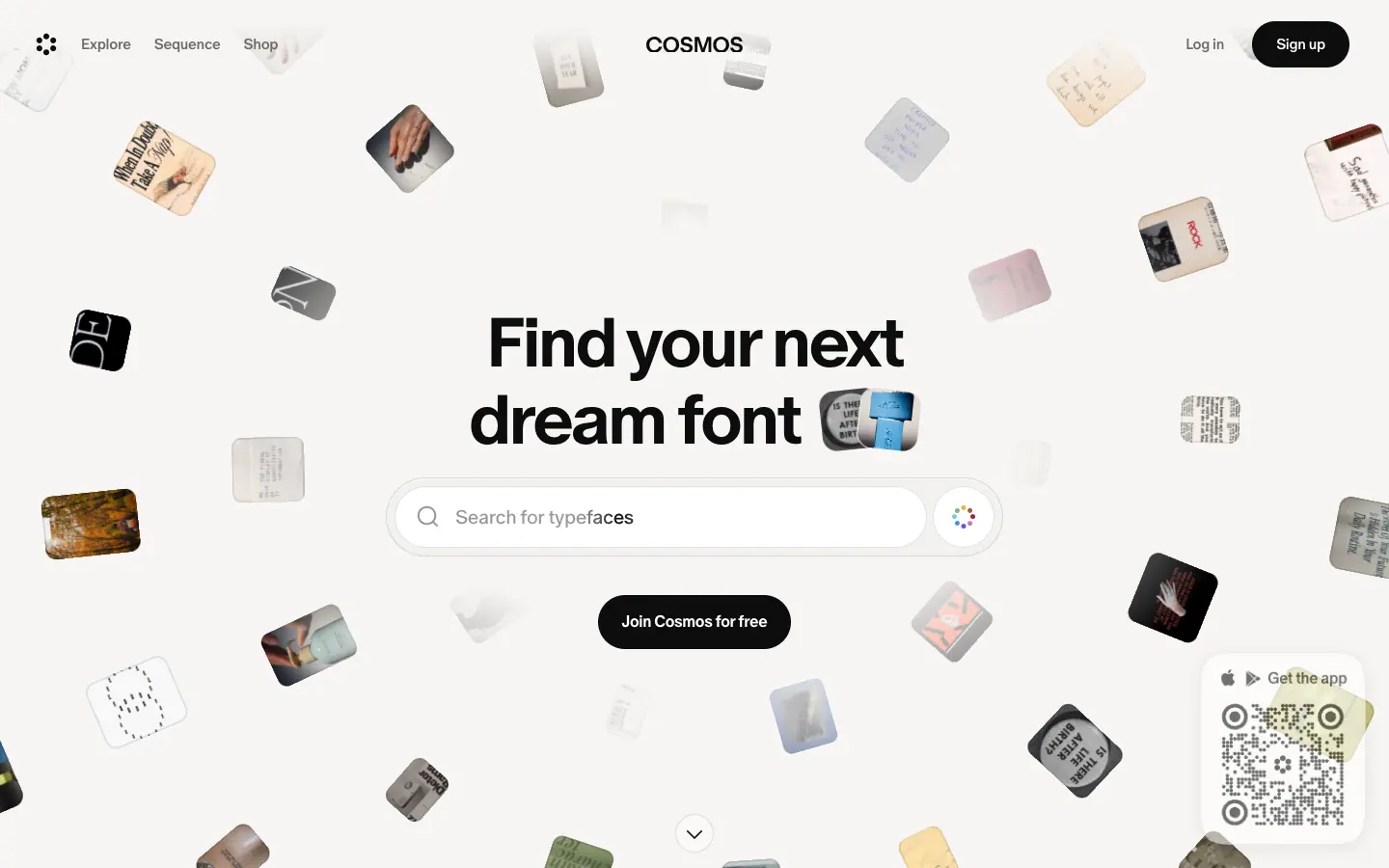
#f7f5f3 paper; a full-viewport <canvas> (1440 × 900) draws ≈50 small photo tiles (counted on one frame). Each tile is rotated, rounded ≈8–12px, and faded or blurred by depth. |
| Headline |
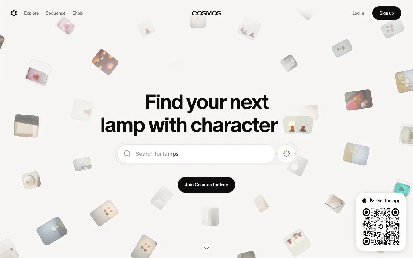
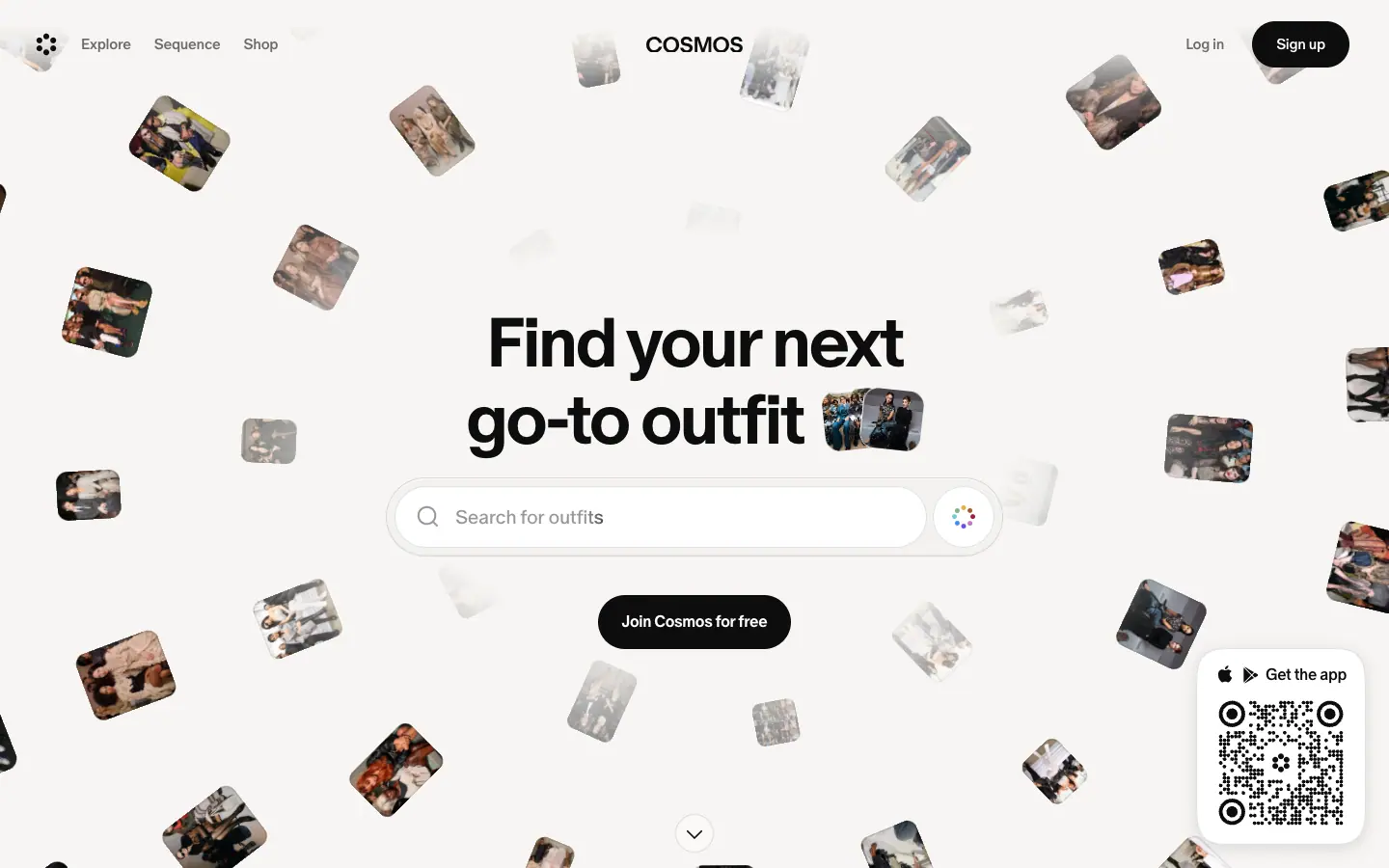
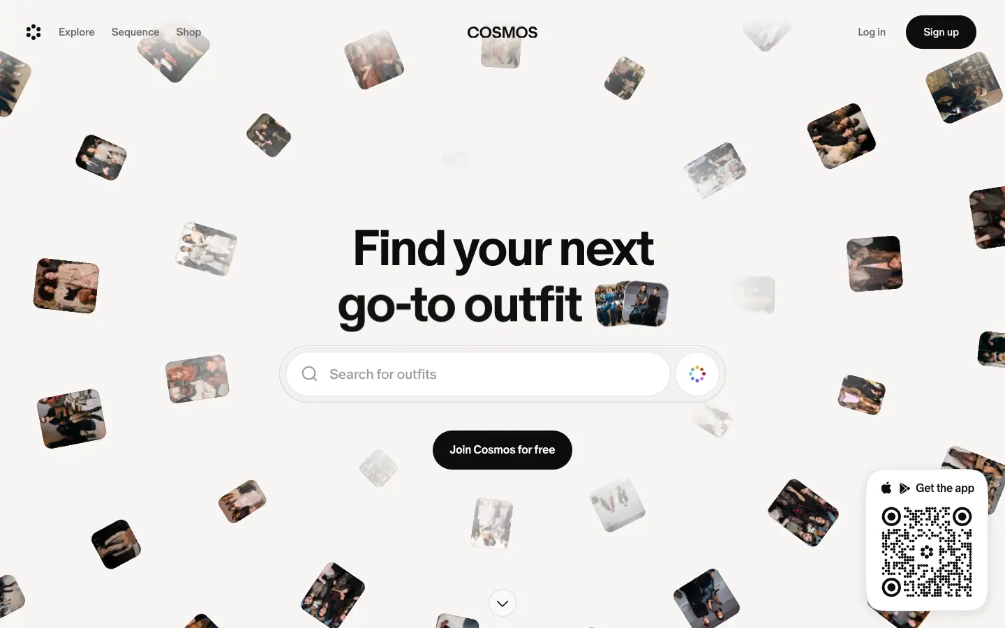
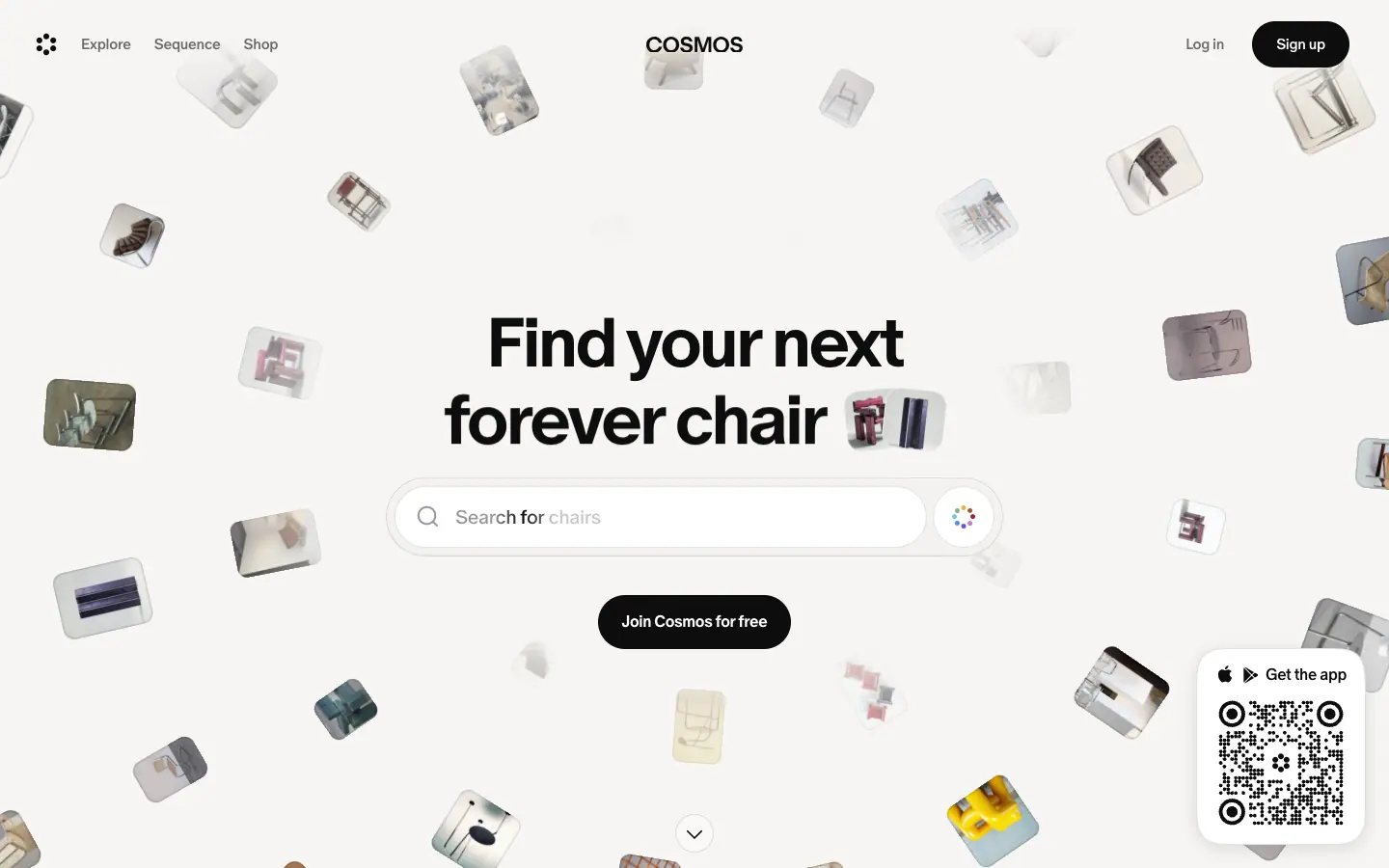
H1, 72 / 72px, weight 700, -2.88px, centred. Line 1 is fixed ("Find your next"). Line 2 rotates every ≈3s: "dream font", "lamp with character", "go-to outfit", "art obsession", "forever chair", "shoot reference" … (6 frames in images/motion). |
| Headline thumbnails |
Two 70 × 70px chips, radius 16px, rotated about ±6° (matrix(0.9945, ∓0.1045, …)), sit after line 2. They show images for the current phrase. |
| Search |
A 640 × 82 frosted pill (#f2f1f0 at 90%, 1px ring at 12%, inset white highlight) wraps a 552 × 64 white pill input plus a round "visual search" button (multi-colour dot ring). Its placeholder syncs with the headline: "Search for typefaces", "Search for photoshoot ideas". |
| CTA |
"Join Cosmos for free": #0d0d0d pill, 56px tall, 16px 700, padding 16 × 24 |
| Extras |
A QR "Get the app" card fixed bottom-right (176 × 204, radius 25%, soft shadow). A 40px round chevron at the bottom centre. |
| Entrance |
hero-enter (scale 0.95 → 1, 0.5s, ease). Canvas uses canvas-enter (blur 20px + scale 0.8 → sharp, 1.8s, cubic-bezier(.16,1,.3,1)) on pages where it applies. |
Why it works:
- The headline is a template: "Find your next ___". The blank is filled with real categories people search for on Cosmos. In one sentence it says what the product does (find things) and who it is for (people with taste in fonts, lamps and outfits).
- The search box is the product. Putting a working search in the hero turns the first click into a product action, not a sign-up.
- The floating tiles show volume ("there are millions of images here") without a single number.
2. Wordmark masthead (Sequence)
| Part |
Measured |
| Wordmark |
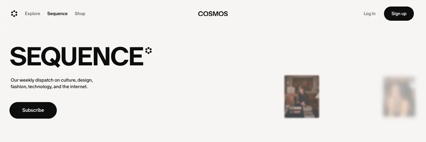
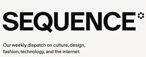
SEQUENCE H1, 88 / 132px, weight 700, -4.4px, caps, with a small flower asterisk glyph at top-right (the Cosmos mark used as a typographic ornament) |
| Dek |
"Our weekly dispatch on culture, design, fashion, technology, and the internet." 16 / 22.4px, 296px wide (3 lines) |
| CTA |
"Subscribe": black pill, 56px tall, 160px wide |
| Right side |
5 floating portrait thumbnails (117–183px wide) scattered at different heights; some are blurred and faded. It is a smaller cousin of the home canvas. |
| Background |
#f7f5f3 paper |
Why: It reads as a magazine cover nameplate. Caps plus very tight tracking is the one place Cosmos uses all caps. That makes Sequence feel like its own publication inside Cosmos.
3. Index header with a thumbnail strip (Editions, Interviews, Aesthetic Studies, Object Love)

| Part |
Measured |
| Back button |
≈40px round chevron pill at top-left (≈x 32, y 132) |
| Title |
H1, 72 / 72px, weight 500, -3%, bottom-left of a 228px-tall block |
| Thumbnails |
4 images top-right (≈92 × 128px), from the index's latest posts. On Interviews the last one is blurred and faded, which suggests more beyond. |
Why: The thumbnails act as a preview of the index, like a magazine section opener. Weight 500 rather than 700 keeps the editorial pages calmer than the marketing home.
4. Featured edition card
| Part |
Measured |
| Card |
1376 × 480, radius 24px, full-bleed photo |
| Text block |
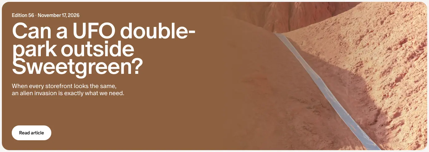
32px padding, 682px wide: meta "Edition 56 · November 17, 2026" (14px), title H2 72 / 57.6px weight 500 white, dek 16px white |
| Button |
"Read article": white pill, ≈40px tall, dark text |
Why: A newsletter issue is presented like a cover story. Line height 0.8 makes the 3-line title a solid block that reads well over a photo.
5. Article header (all Sequence posts)
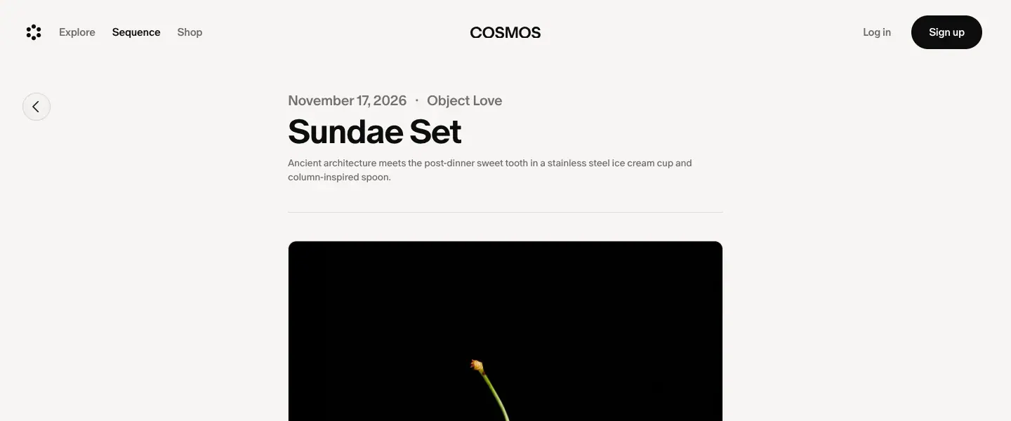
| Part |
Measured |
| Column |
620px, centred (x = 410) |
| Meta |
"November 17, 2026 · Object Love" 20 / 23px, 500, #6e6a69. The category is a link. |
| Title |
48 / 48px, 700, -3%, #0d0d0d (a <p> element) |
| Dek |
14 / 19.6px, #6e6a69 |
| Rule |
A hairline divider below the header block |
| Back |
40px round chevron button at x 32 |
Why: It is a book-page title block: small, left-aligned, then straight into the text or the photo. No hero image is forced; each template decides what comes first.
6. Tinted interview card
| Part |
Measured |
| Card |
800 × 500, centred, radius 20px; background sampled from the photo (rgb(207 186 163) for Tal Silberstein) |
| Photo |
Portrait on the left, radius 12px |
| Text |
Date (16px white), "A moment with" (20px), name 48 / 48 weight 400 white, dek 12–14px white |
Why: Each interview gets a unique colour without art direction work, and the card reads like an album cover or a printed postcard. Risk: white text on light tints fails contrast (1.87:1 on this card).
7. Brand storefront hero
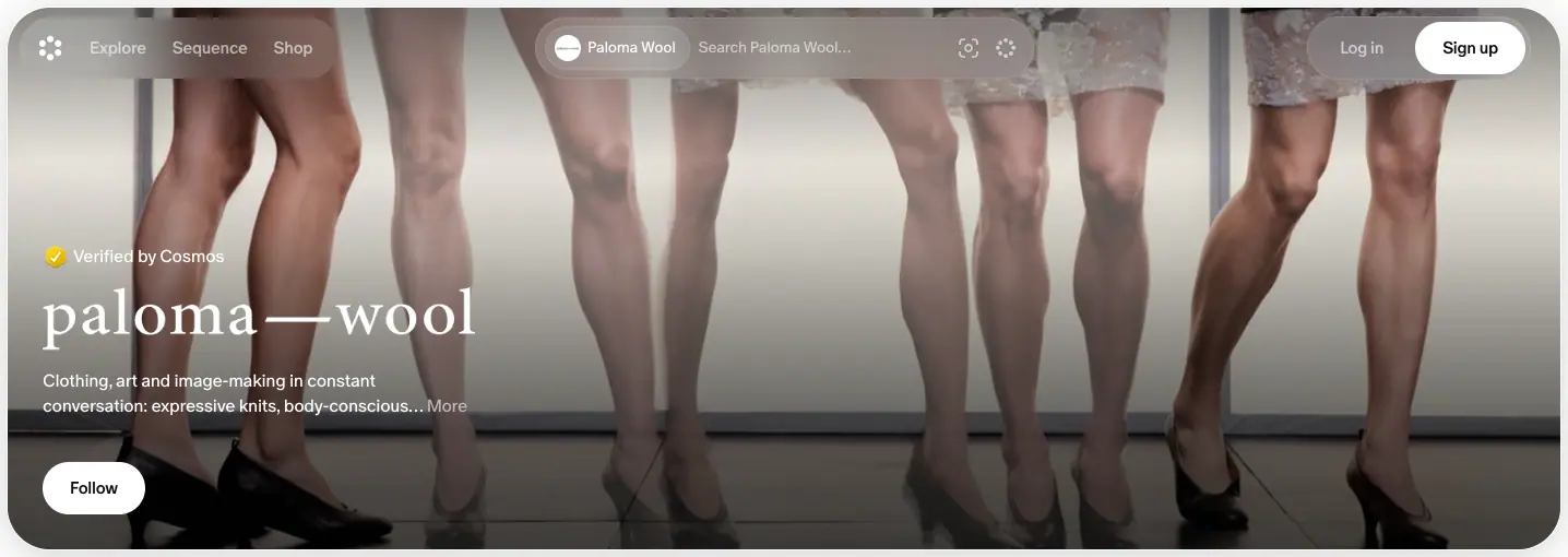
| Part |
Measured |
| Frame |
1424 × 498, inset 8px from the viewport edge, radius 40px, overflow: clip |
| Image |
The brand's campaign photo, full bleed in the frame |
| Scrims |
linear-gradient(rgba(0,0,0,.47) 0%, transparent 81%) at the top; linear-gradient(transparent 45%, rgba(0,0,0,.3) 90%) at the bottom |
| Content |
"Verified by Cosmos" badge, the brand's own logo lockup (for example "paloma — wool"), a 2-line description with "More", a white "Follow" pill |
| Header |
Turns transparent with white text and a white Sign-up pill, over the photo |
Why: The 8px inset and 40px radius make the hero feel like an app card or a phone wallpaper, not a website banner. Using the brand's own logo and photo makes the page feel brand-owned, which matters to the fashion labels Cosmos partners with.
Pages with no hero
- Explore, Shop, search: the 92px header holds the search field. Tabs follow at y ≈ 96, then content at y ≈ 150. The product starts immediately.
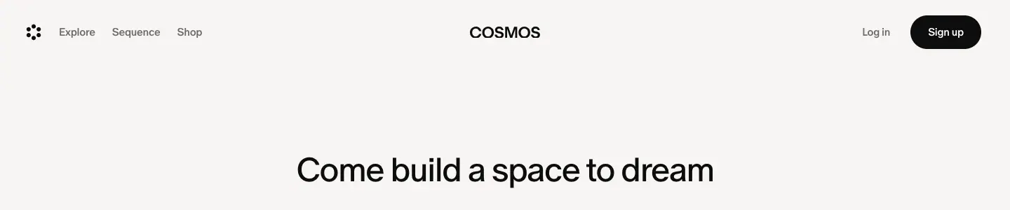
- Careers: a centred 48px title ("Come build a space to dream"), a 20px subline and a "Join us" pill, then a photo strip of the team.
- 404: a 5-dot mark, "Content not found", "Sorry, you can't access this." and a "Home" pill, centred in the viewport.
06 · Section types
These are all the section blocks found across the 22 captured pages, grouped by job. Each entry gives the measured build, where it appears, and why it is there.
A. Marketing blocks (home only)
A1. Feature carousel: "Build your world, your way"
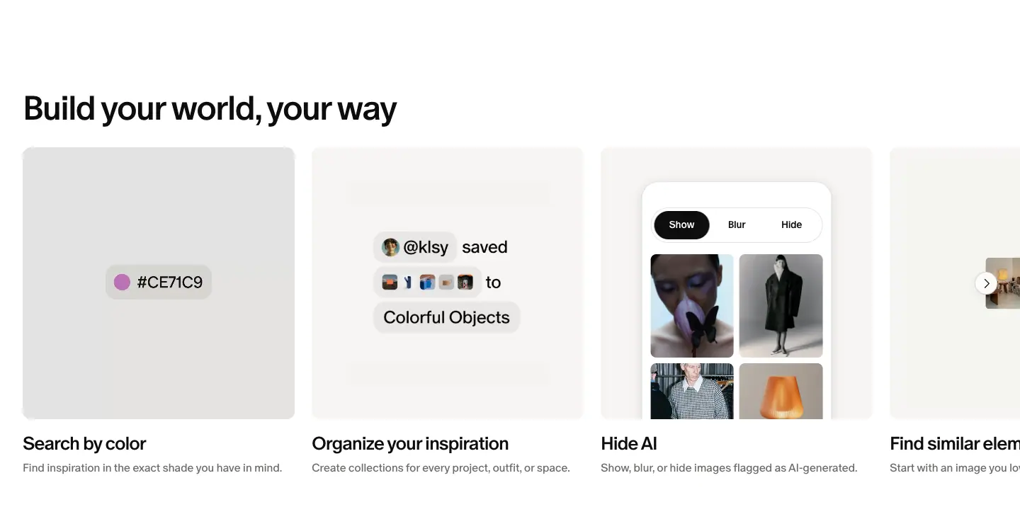
- Build: H2 48px at y 1028. A horizontal row of six 384px
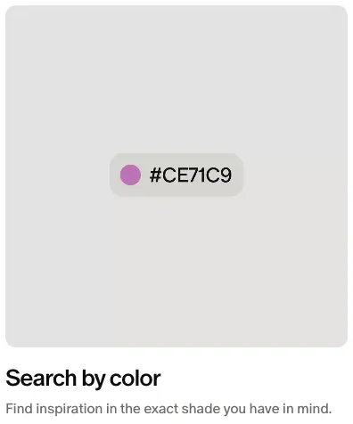
article cards with a 24px gap, so it overflows to the right. Each card is a 384 × 384 #f7f5f3 tile (radius 12px) holding a muted, looping <video>, then a 26px title and a 16px grey line: "Search by color", "Organize your inspiration", "Hide AI", "Find similar elements", "Collaborate together", "Save from anywhere". A round white chevron button pages the row.
- Why: Six features in one horizontal row keep the page short. Video demos inside quiet paper tiles show the real UI (a
#CE71C9 colour chip, a "@klsy saved … to Colorful Objects" toast, a Show / Blur / Hide switch) with no device frames or gradients.
A2. Typographic list selector: "Shop from brands like"
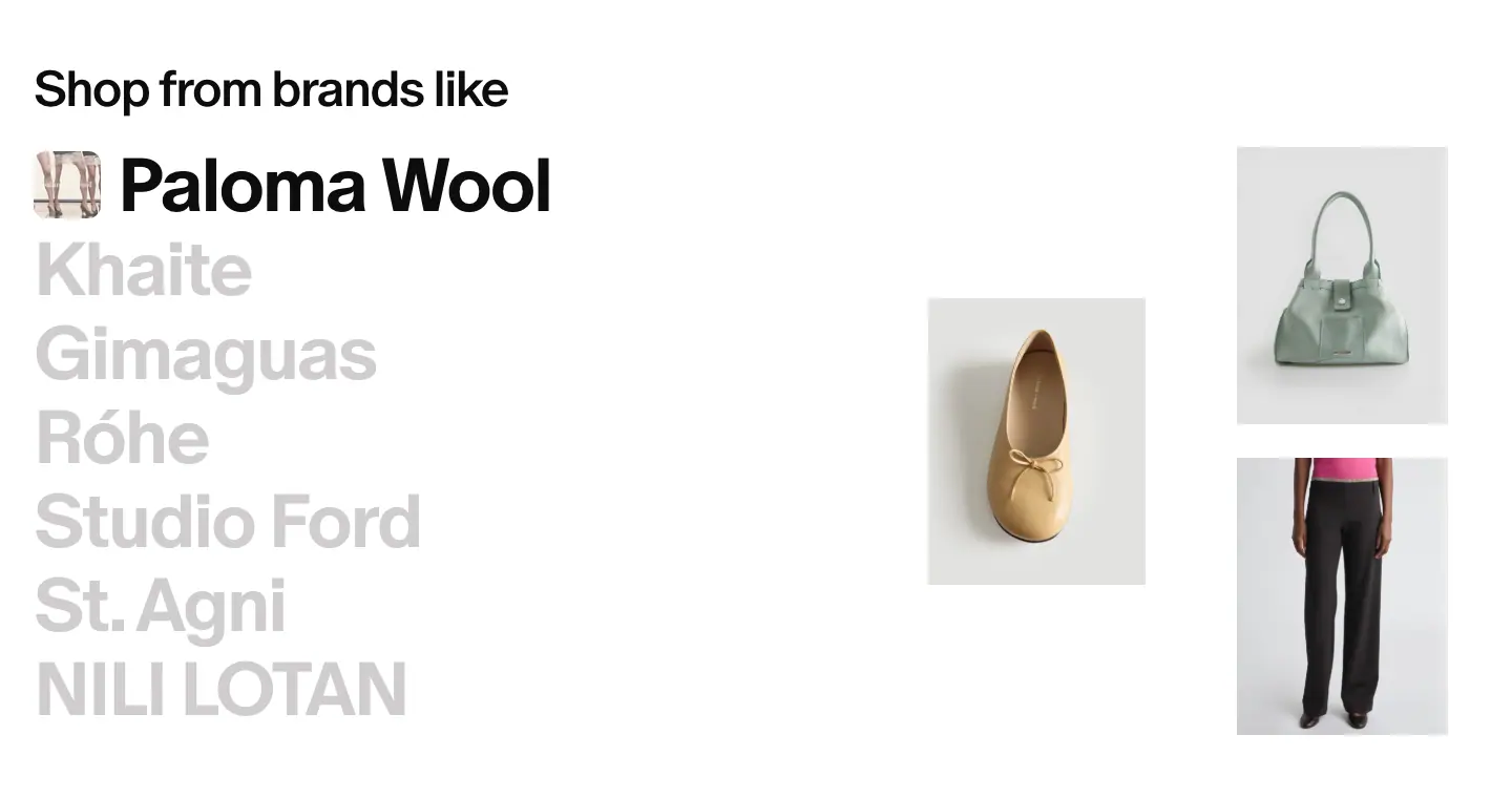
- Build: Seven brand names stacked at 72 / 72px, weight 700, 80px pitch. The active name is
#0d0d0d with a 70px photo chip before it; the rest are #d0cdcd. On the right, a 3-image product collage (≈140 × 190px images, staggered heights) shows that brand's products. The list auto-cycles about every 3s ≈. The active slot swaps to brands not in the static list (for example "Anastasio Home" replaced "Khaite" during capture; see motion frame).
- Why: Brand names are the proof. Setting them as huge type turns a logo wall into an editorial index, like a fashion magazine contents page. The grey-out keeps one focus at a time.
A3. Creator carousel: "Find what others are saving"
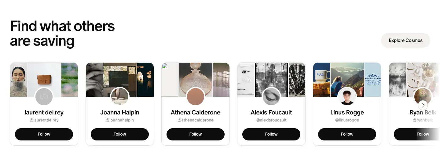
- Build: 2-line H2 at left, "Explore Cosmos" secondary pill (
#f2f1f0) at right. Cards are 224 × 272, radius 16px, white with a soft shadow. Each has a 3-image strip on top, a 56px ≈ circular avatar overlapping the strip, name (20px 500), handle (14px #9a9796) and a full-width "Follow" black pill (40px). The row fades out on the right edge (--fade-*-intensity mask, 0.2s transition).
- Why: Social proof through people and their taste, not through quotes. The Follow button makes it feel like a live product.
A4. Logo marquee

- Build: The caption "Used by the world's leading creative teams, studios, and students." is 20px 500
#9a9796. Below it are two rows of grey logos (Nike, Aēsop, Apple, Pentagram, Bandit, Gucci, Spotify, On, Loewe, Chanel, Highsnobiety, MoMA …), scrolling in opposite directions: marquee-left and marquee-right, 56s linear infinite, translate 0 → -50%.
- Why: Opposite directions read as "a big, varied list" with no pagination. Grey logos keep the brands from fighting the black UI.
A5. Closing CTA footer
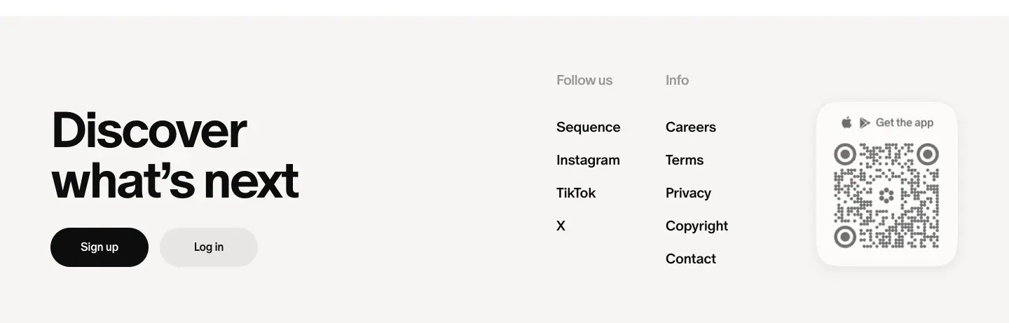
- Build: A
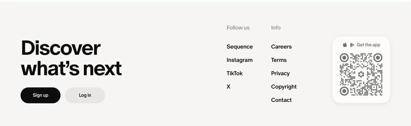
#f7f5f3 block with padding: 80px 72px. "Discover what's next" is 72px 700 on two lines, with Sign up (black) and Log in (#e8e6e4) pills below it. "Follow us" and "Info" link columns sit at x 794 and x 950 (20px 500), and the QR card sits at the right.
- Why: The footer is the final ask, set in the same voice as the hero.
B. Product blocks (Explore, Shop, search, brand)
B1. Tab bar

- Build: Centred pill tabs, 14px 500. The active tab has a
#f2f1f0 fill; others are #9a9796. "Sale" is #0700ff. On Explore there are 18 tabs (Featured, Fashion, Interiors, Graphic Design, Art, Branding, Typography, Architecture, Weddings, Interfaces, Nature, Cinema, Motion, Technology …).
- Why: Categories as pills look like filters, not navigation. You stay in one browsing surface.
B2. Collection card row: "Selected by Cosmos"

- Build: Cards ≈255px wide with a 3-image collage (radius ≈12px), title 16px 500, meta "@shop ✓ · 132 elements" 14px
#9a9796. Horizontal scroller with a chevron.
- Why: It shows the product's core object, a collection, as the unit of curation.
B3. Five-column masonry
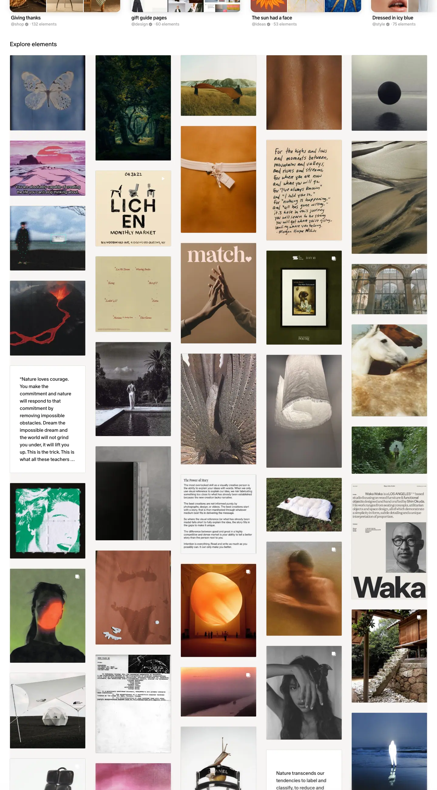
- Build: 5 columns, 248px images, ≈33.5px gutters, radius 3px, natural aspect ratios. Text "elements" (quotes) appear as white cards in the same flow. On hover, the image dims with
#0d0d0d at 40% and a white "Save" pill (65 × 34, 14px 500) appears at the top-right.
- Why: Masonry preserves every image's crop. It is the visual language of mood boards.
B4. Product shelf
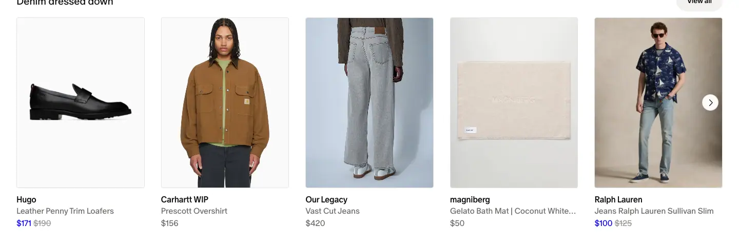
- Build: Section label 20px ("Denim dressed down") with a "View all" pill at right. 5 product cards (248px image, radius 4px, white-grey product shot) plus a chevron. Text below: brand (16px 500), product name (16px
#6e6a69), price (16px), sale price #0700ff with the old price #9a9796.
- Why: This is the standard e-commerce shelf, but using Cosmos type and curation titles ("The bedside edit") instead of SKU categories.
B5. Brand banner carousel
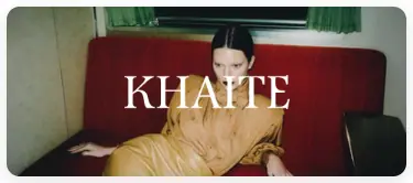
- Build: 363 × 154 photo cards with the brand's logo set large in white over the photo.
- Why: The brand's own identity sells the brand. Cosmos stays neutral.
B6. Editorial promo + products (Shop)
- Build: A tall portrait photo card (≈530px wide) with the brand name in light caps and a white "Shop" pill, next to a 3 × 2 grid of the brand's products on grey studio backgrounds with white names overlaid.
- Why: It mixes lookbook and catalogue, as fashion e-commerce does.
B7. Filter bar + product grid (brand storefront)
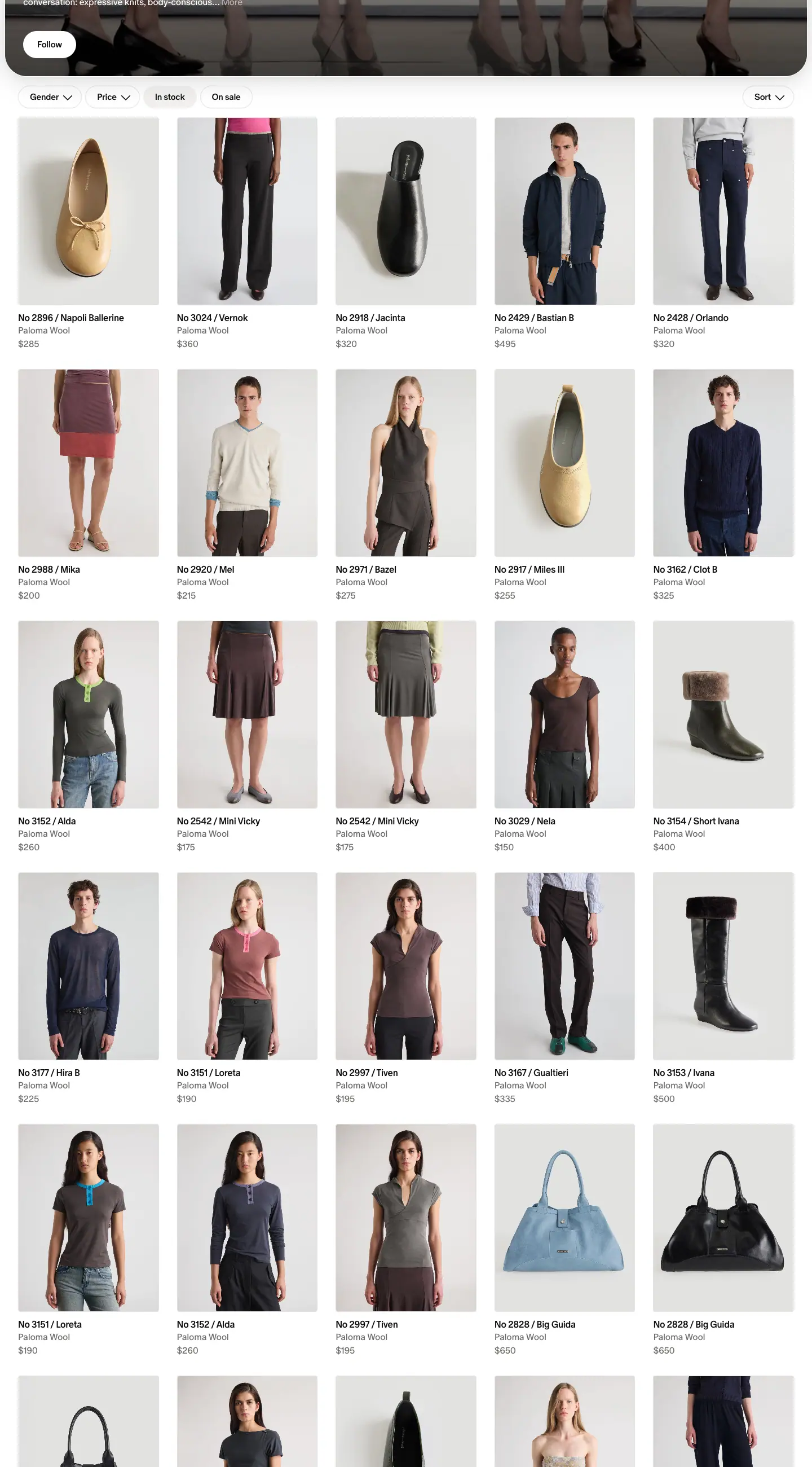
- Build: Pills "Gender ⌄", "Price ⌄", "In stock", "On sale" (15px 500) at left, "Sort ⌄" at right. Below is a 5-column grid of 248px product images with 3 text lines.
C. Editorial blocks (Sequence)
C1. Story row with mixed card sizes (Sequence bento)
- Build: Row title (32px 500) with a "See all" pill (
#f2f1f0, 40px). Below is a 4-column grid: one 2-column tinted feature card (676 × 477) plus two single cards (326 × 477). Each single card is white with a 0.5px ring, radius 20, a 258px inset image (radius 12), a category line (16px #6e6a69) and a title (26px 500), centred. On hover, the card fills #fcfbfa and the image scales to 1.02 (0.3s).
- Why: Mixed sizes create hierarchy inside one row, a light bento. Centred captions under framed images make it look like a museum label.
C2. Index grids
| Index |
Grid |
Card |
| Editions |
3 columns, 443px |
Image tile (radius 12) + "Edition 55 · November 10, 2026" (14px #9a9796) + title 26px 500, centred |
| Interviews |
2 columns, 676px |
Portrait 283px at left + date, name 48px, dek at right |
| Object Love, Aesthetic Studies |
4 columns, 326px |
Framed image 258px + date + title 26px, centred |
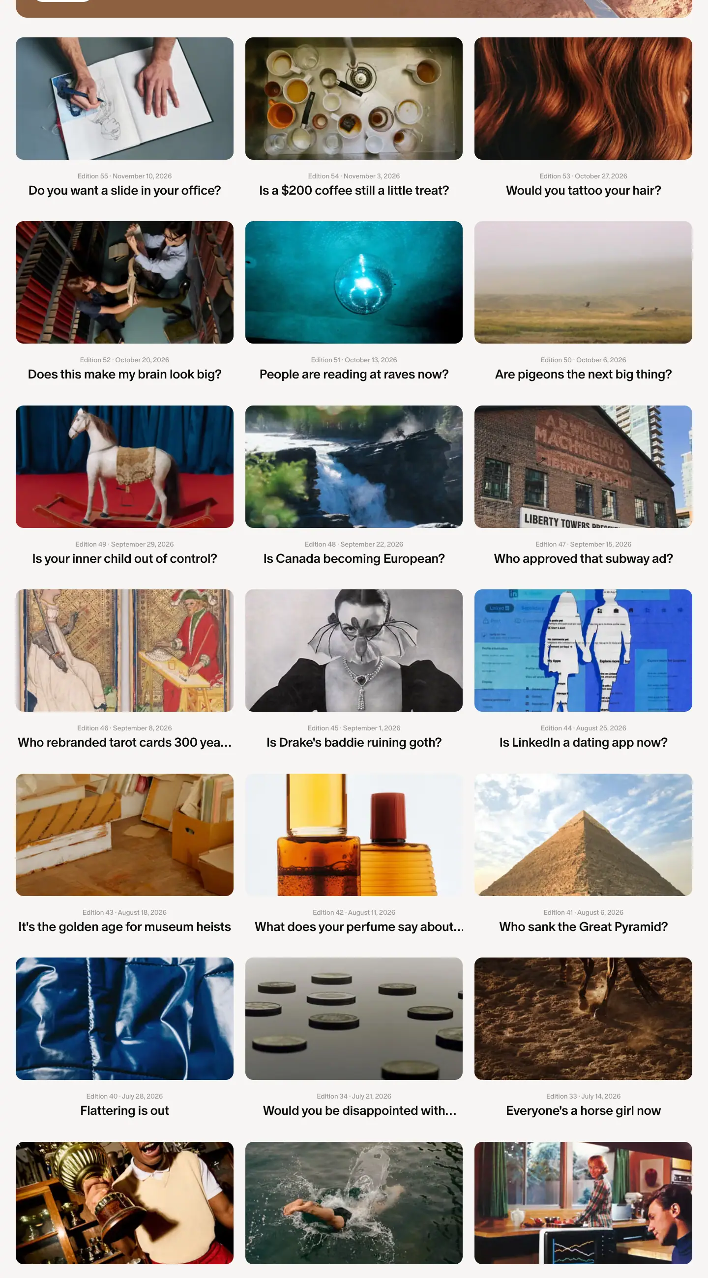
C3. Article bodies
| Template |
Body pattern |
| Edition |
Section heads 32px 700 ("Internet Microdoses"). Items use a bold run-in lead + body at 20/32, then a grey "Stand up for cinema →" link. Image pairs at 620px (radius 8). Credits are 12px. |
| Interview |
Intro paragraph, then bold questions (20px 700) and regular answers (20/32). Product photo triptych near the end. |
| Object Love |
One studio photo (≈540px wide, radius 12) on a matched backdrop, 2–3 paragraphs, an inline price line with underlined links. |
| Aesthetic Study |
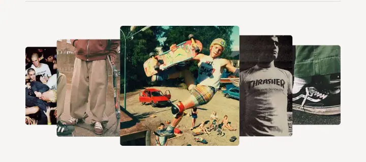
A fan or collage of 5 overlapping images at the top, then an essay with inline images and a bulleted "further reading" list. |
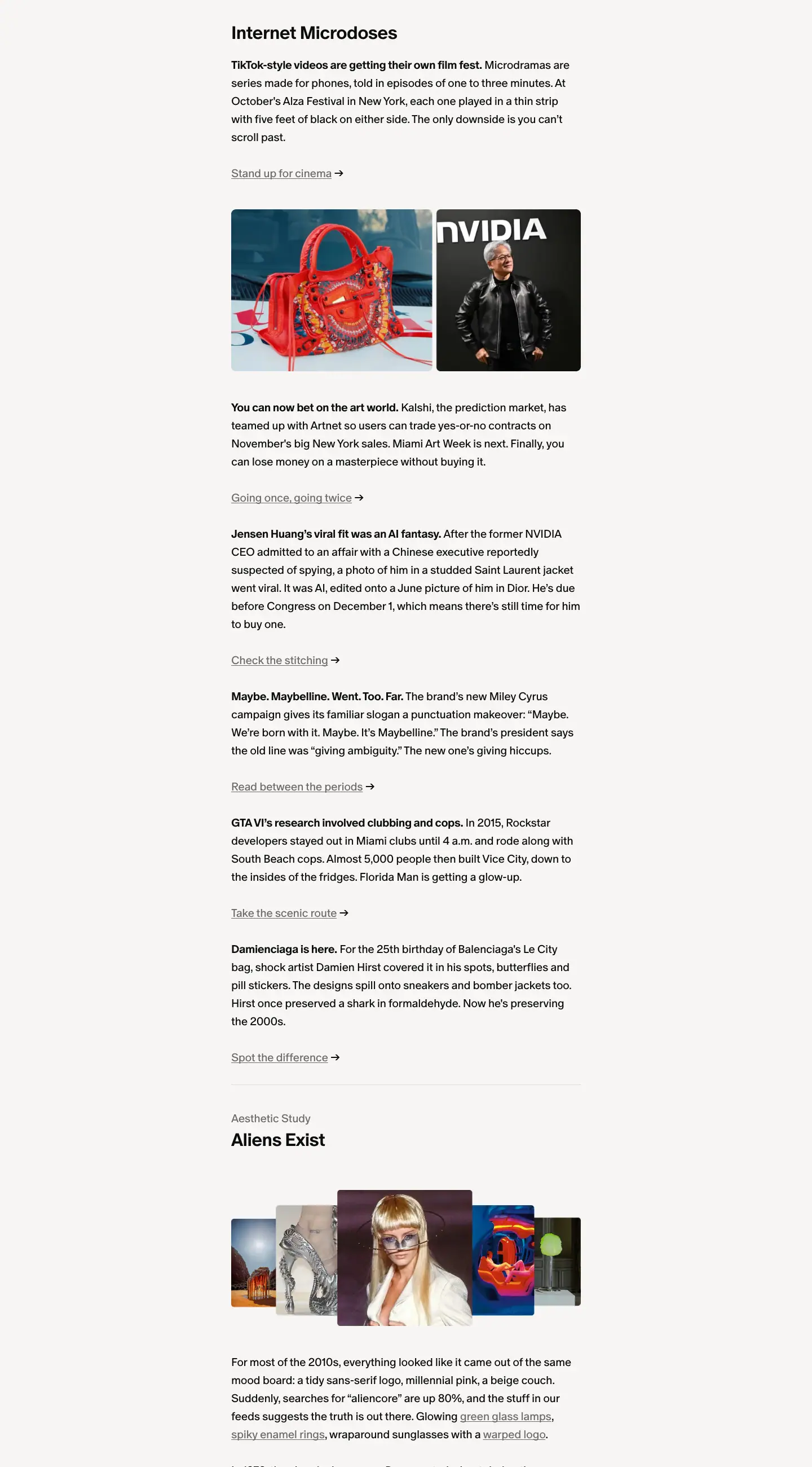
C4. "More from Sequence" + newsletter CTA

- Build: Two story cards side by side. Then a centred 48px 500 statement "Sequence is read by 4 million creatives every week", a 16px grey line "Join Cosmos to get Sequence in your inbox", and a black pill "Get the app" or "Sign up".
- Why: The reader is at the bottom of the story with attention to spare. The number is the proof.
D. Utility blocks
D1. Photo strip (careers)

A full-bleed row of 8 team photos (≈180 × 180px, radius 4–8 ≈). The page defines a scroll-left keyframe (translate 0 → -505px), which matches a slow strip scroll.
D2. Definition list (careers benefits)
Labels in a 240px column (20px 500: Focus, Culture, Care), values listed at the right (16px): "Premium hardware", "Commuter benefits", "Free lunch & dinner", "Museum passes", "Superpower membership" …
D3. Numbered clauses (legal)
A 720px column, 20px 600 clause heads ("1. Agreement to Terms"), 16px Book (350) body, bold run-in sub-clauses "(A) Posting Content.".
D4. Canvas + info popover (Public Work)
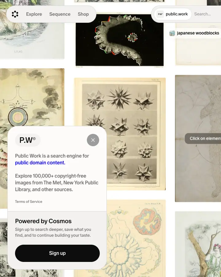
A full-viewport pannable canvas of public-domain images, with a floating white popover at the left: "P.W°" logo, a "Public Work is a search engine for public domain content." link, "Explore 100,000+ copyright-free images from The Met, New York Public Library, and other sources.", a "Powered by Cosmos" box and a black Sign-up pill.
D5. Empty state (404)
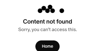
A 5-dot mark (four dots grouped plus one apart), "Content not found" (20px 500), "Sorry, you can't access this." (16px #6e6a69), and a black "Home" pill (80 × 40).
07 · Copywriting and voice
Cosmos writes in two registers:
- Product voice (home, Explore, Shop, buttons): short, lowercase-friendly, warm, about the user's own taste. It never says "AI", "platform" or "workflow" in a headline.
- Editorial voice (Sequence): a culture magazine with a wink. Headlines are questions. Link labels are puns.
Product voice
The hero formula: "Find your next ___"
The H1 rotates through real search intents, measured over ≈20 seconds:
Find your next dream font · lamp with character · go-to outfit · art obsession · forever chair · shoot reference
The search placeholder changes with it: "Search for typefaces", "Search for photoshoot ideas".
Why it works:
- "Your next" assumes the reader already has taste and is always looking. It flatters the audience.
- Each phrase carries an emotional modifier ("dream", "with character", "go-to", "forever", "obsession"). It is about desire, not about features.
- The examples cross categories (type, furniture, fashion, art, photography), which defines the audience by taste rather than by job title.
Section titles: possessive and active
| Title |
Pattern |
| Build your world, your way |
Imperative + "your" twice |
| Shop from brands like … |
Sentence that the list below completes |
| Find what others are saving |
Social curiosity |
| Discover what's next |
Echoes the hero ("your next") as a closing bookend |
Feature lines: verb + noun, then one benefit sentence
| Title |
Line |
| Search by color |
Find inspiration in the exact shade you have in mind. |
| Organize your inspiration |
Create collections for every project, outfit, or space. |
| Hide AI |
Show, blur, or hide images flagged as AI-generated. |
| Find similar elements |
Start with an image you love and find more like it. |
| Collaborate together |
Invite others to build collections with you. |
| Save from anywhere |
Save inspiration to Cosmos as you browse the web. |
Each line is one sentence of 7–11 words with no jargon. "Hide AI" is a deliberate position statement: Cosmos sides with human-made work, and puts that in a 2-word feature title.
Microcopy
| Context |
Copy |
| Primary CTA |
"Join Cosmos for free" (desktop), "Download app" (mobile) |
| Header |
"Log in" / "Sign up" |
| Secondary |
"Explore Cosmos", "See all", "View all", "Follow", "Save", "Shop" |
| Social proof |
"Used by the world's leading creative teams, studios, and students." |
| Explore meta |
"@shop ✓ · 132 elements": Cosmos calls saved items elements |
| Brand trust |
"Verified by Cosmos" |
| App card |
"Get the app" |
| 404 |
"Content not found" / "Sorry, you can't access this." / "Home" |
| Meta description (home) |
"Your space for inspiration" |
Editorial voice (Sequence)
Edition headlines are questions
Can a UFO double-park outside Sweetgreen? · Is a $200 coffee still a little treat? · Do you want a slide in your office? · Would you tattoo your hair? · Does this make my brain look big? · People are reading at raves now? · Are pigeons the next big thing? · Who approved that subway ad? · Is LinkedIn a dating app now? · Would you eat your purse?
Why: A question is a hook in an inbox subject line. Each one pairs a high-culture idea with a low-culture reference (UFO + Sweetgreen; $200 + "little treat"). That tension is the brand: serious taste, unserious tone.
Deks: one clever sentence
- "When every storefront looks the same, an alien invasion is exactly what we need."
- "Ancient architecture meets the post-dinner sweet tooth in a stainless steel ice cream cup and column-inspired spoon."
- "How the hoodies, work pants, and sneakers worn in mosh pits and on skate ramps became an everyday uniform."
- "On starting with fabric, writing by hand, and the Alice Coltrane record that's watched over the shop since day one."
The pattern is "X meets Y", "How A became B", or "On a, b, and c", with concrete nouns every time.
Microdose items: bold claim, short body, pun link
TikTok-style videos are getting their own film fest. Microdramas are series made for phones, told in episodes of one to three minutes … The only downside is you can't scroll past.
Stand up for cinema →
Other link labels: "Going once, going twice →" (art auction), "Check the stitching →" (AI-made jacket photo), "Read between the periods →" (Maybelline punctuation), "Take the scenic route →" (GTA VI).
Why: The bold first sentence lets a skimmer get the news in one line. The pun link rewards the reader who wanted more.
Category names
"Editions", "Interviews", "Aesthetic Studies", "Object Love". Two are plain and two are poetic. "Object Love" names a feeling, not a format.
Interview format: "A moment with …"
Cards say "A moment with Tal Silberstein". Questions are conversational: "What's been going on at Colbo recently?", "Tell us your favorite products from your recent collection".
Careers voice
Come build a space to dream
We're looking for curious minds to join the team
Cosmos is where the world's best taste comes to light.
It's where millions come to discover, collect, and share the most beautiful things on the internet. Now, we're building the next chapter.
We're a small, intentional team in SoHo that obsesses over craft, and cares deeply about one another. …
If you care about culture, craft, and doing the best work of your career—come build with us.
Benefits are grouped under Focus / Culture / Care: "Premium hardware", "Free lunch & dinner", "Seasonal retreats", "Museum passes", "Superpower membership", "Generous PTO".
Rules to reuse
- Speak to taste, not tasks: "your next dream font", not "manage your assets".
- Use concrete nouns from the user's world: lamp, chair, font, outfit, shoot.
- Make headlines questions when the content is opinion or news.
- Bold the first sentence of every news item.
- Write link labels as puns or verbs, never "Read more".
- Take one clear stance in plain words ("Hide AI").
- Keep UI labels to 1–3 words.
08 · Components
All values are measured at 1440px. "Pill" means border-radius: calc(infinity * 1px) (Tailwind rounded-full), which the browser reports as 3.35544e+07px.
Header

| Part |
Marketing / editorial header |
Product header (Explore, Shop, search, brand) |
| Height, position |
92px, sticky, z-index: 200, no background, no border |
same |
| Backdrop |
A paper gradient (#f7f5f3 0–15%, 92% at 26%, then fading out) sits behind it, so content fades under the header instead of hitting a hard bar |
same; transparent with white text over the brand hero |
| Left |
32 × 32 flower mark at x 32, then Explore / Sequence / Shop links (15px 500, #6e6a69 → #0d0d0d on hover, 150ms) |
same |
| Centre |
COSMOS wordmark, 100 × 17px |
a search pill: 457 × 56, #fcfbfa, 1px ring at 12% black, padding 8px, 14px input, with image-search and visual-search icon buttons at the right |
| Right |
"Log in" ghost pill (90 × 48, #6e6a69 → #0d0d0d) and "Sign up" black pill (101 × 48, #0d0d0d → #232323 on hover) |
same |
Why: The header has no background, so it never cuts an image in half. The gradient keeps text readable when content scrolls under it.
Buttons
| Variant |
Size |
Fill / text |
Type |
Hover |
| Primary L |
56px tall, padding 16 × 24 |
#0d0d0d / white |
16px 700 (hero) or 500 (footer) |
#232323 |
| Primary M |
48px, padding 16 × 24 |
#0d0d0d / white |
15px 500, -0.28px |
#232323 |
| Primary S |
40px, padding 16 × 20 |
#0d0d0d / white |
14px 500 |
#232323 |
| Secondary |
40–56px |
#f2f1f0 / #0d0d0d ("Explore Cosmos", "See all") |
14–15px 500 |
#e8e6e4 per the --light-hover-secondary token; a scripted hover in the capture did not change it, so this is unconfirmed |
| Secondary on paper |
56px |
#e8e6e4 / #0d0d0d (footer "Log in") |
16px 500 |
— |
| Ghost |
48px |
transparent / #6e6a69 |
15px 500 |
text → #0d0d0d |
| On-media |
≈40px |
white / #0d0d0d ("Follow", "Read article", "Shop", "Save") |
14px 500 |
— |
| Icon (carousel) |
32 × 32 round |
#fcfbfa, 1px ring 12%, shadow 0 3px 12px rgba(0,0,0,.05) |
chevron icon |
— |
| Icon (back) |
≈40 × 40 round |
same family |
chevron-left |
— |
All buttons use transition: 0.15s cubic-bezier(0.4, 0, 0.2, 1) on colour and background.

Search pill (hero)

| Layer |
Value |
| Outer shell |
640 × 82, pill, padding 8px, #f2f1f0 at 90% (oklab(0.9586 … / 0.9)), 1px ring #0d0d0d at 12%, box-shadow: rgba(255,255,255,.7) 0 1px 1.5px inset, rgba(0,0,0,.03) 0 -1px 1.5px inset |
| Input |
552 × 64 white pill, padding 0 12px 0 20px, 1px ring 12%, search icon, 20px text |
| Placeholder |
"Search for" in #9a9796; the rotating keyword ("typefaces") animates in max-width 0.2s ease-out, color 0.15s |
| Visual-search button |
64px round white button with a ring of coloured dots (the "similar" feature) |
Why: The double pill (frosted shell + white well) gives depth without a drop shadow. The inset highlights make the shell look like a soft material.
Tabs
- Pills 40px tall, padding 10 × 20, 14px 500.
- Inactive tabs are
#9a9796; the active tab is #0d0d0d text on a #f2f1f0 pill.
- The tab row scrolls horizontally on Explore (1704px wide inside a 1376px frame) and is centred on Shop.
- A tab indicator line uses a centred gradient:
linear-gradient(90deg, transparent calc(50% - 42px), #0d0d0d, transparent calc(50% + 42px)).
Cards
| Card |
Size |
Radius |
Surface |
Contents |
| Home feature |
384 × 464 |
media 12px |
media tile #f7f5f3 |
looping video, 26px title, 16px grey line |
| Creator |
224 × 272 |
16px |
white, soft shadow |
3-image strip, overlapping avatar, name, handle, Follow pill |
| Collection |
≈255 wide |
≈12px |
3-image collage |
title 16px 500, meta 14px grey |
| Saved image |
248 wide |
3px |
the image |
hover: 40% dark overlay + white "Save" pill |
| Product |
248 wide |
4px |
grey studio photo |
brand, name, price (sale in #0700ff) |
| Story |
326 × 477 |
20px, image 12px |
white, 0.5px ring at 12% |
inset 258px image, category, title, centred; hover: #fcfbfa fill, image scale 1.02 (0.3s) |
| Feature story |
676 × 477 |
20px |
photo-tinted colour |
photo, "A moment with", name 48px |
| Interview index |
676 × 530 |
20px |
white, ring |
283px portrait + date, name 48px, dek |
| Edition tile |
443 wide |
12px |
image + text below |
meta 14px, title 26px, centred |
| Featured edition |
1376 × 480 |
24px |
full photo |
72px white title, white pill |
| QR app card |
176 × 204 |
25% |
white, 0 2px 12px rgba(0,0,0,.02), 0 4px … rgba(0,0,0,.1) |
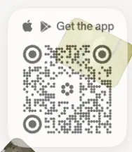
Apple + Play icons, "Get the app", dotted QR with the flower in the centre |
Badges and chips
- AI badge (home "Hide AI" demo): 32 × 32 circle, 12px 500 white "AI" on dark.
- Verified: a small grey verified badge after handles ("@shop ✓ · 132 elements") and "Verified by Cosmos" on brand heroes.
- Colour chip (feature demo):
#CE71C9 dot + hex code on a #f2f1f0-like pill.
- Thumbnail chips in the hero headline: 70 × 70, radius 16px,
#f2f1f0 frame, rotated ±6°.
Filters (brand page)
"Gender ⌄", "Price ⌄", "In stock", "On sale", "Sort ⌄": pills, 15 / 18px, 500, -0.3px.
Footer
Two footers exist. See Shared header and footer.
- Home footer: a
#f7f5f3 block with padding: 80px 72px, a 72px statement, Sign up / Log in pills, "Follow us" (Sequence, Instagram, TikTok, X) and "Info" (Careers, Terms, Privacy, Copyright, Contact) link columns in 20px 500 #0d0d0d under grey 20px headings, and the QR card.
- Compact footer (every other page): one row.
COSMOS © 2026 at the left. "Connect" (Instagram, TikTok, X) and "More" (Terms, Privacy, Copyright) groups at the right, 14px 500: group labels in #0d0d0d, links in #9a9796.

09 · Art direction
The Cosmos interface is neutral so the images can carry the art direction. Four image worlds sit side by side on the site, and the interface treats each one differently.
1. User-saved imagery: the archive look
Where: Explore, search results, Public Work, the home canvas and creator strips.
What it looks like:
- Analogue and archival material: film grain, scanned book pages, type specimens, botanical engravings, handwritten notes, museum objects, cyanotype-like blues, 1970s interiors.
- Natural aspect ratios. Nothing is cropped to a fixed ratio in the masonry.
- Corners of 3px. That is just enough to soften, and not enough to "style".
Why: Cosmos's audience saves "taste", and taste on Cosmos looks like a well-kept physical archive. Showing images uncropped respects the curator's choice. The search page for "typefaces" (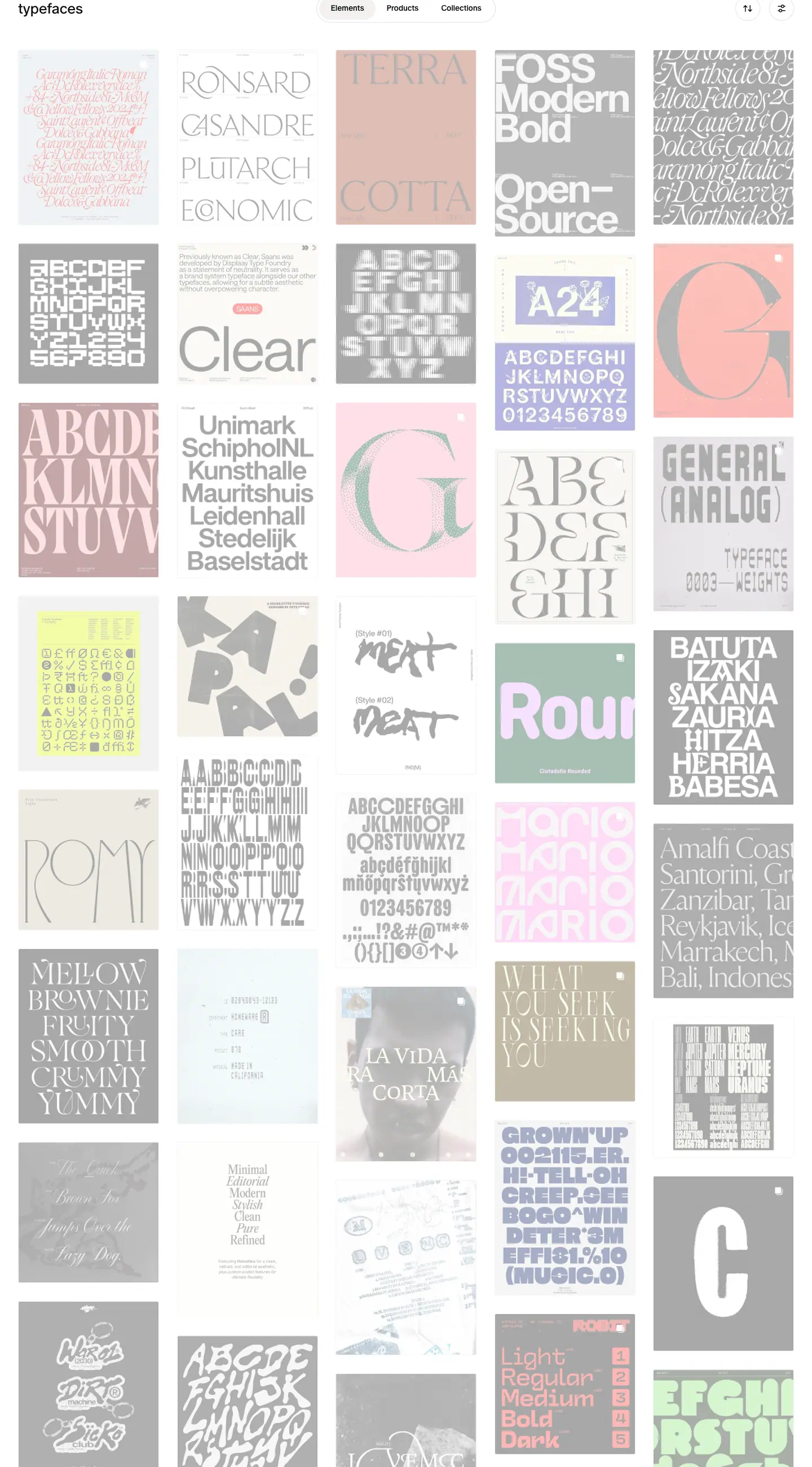 ) is effectively a type-specimen wall.
2. Brand campaign and product photography: the catalogue look
Where: Shop, brand storefronts, the home brand list.
What it looks like:
- Campaign images in the brand hero (Paloma Wool: legs in tights against a white wall), cropped wide and placed under a dark scrim.
- Product packshots on light-grey seamless backgrounds (#e9e9e9-ish ≈), model shots cut at the neck or knee, consistent 4:5-ish crops in a 4px-radius frame.
Why: The brands supply this photography. Cosmos keeps it in a strict grid so very different brands look like one catalogue.
3. Editorial portraiture: the magazine look
Where: Sequence interviews and index pages.
What it looks like:
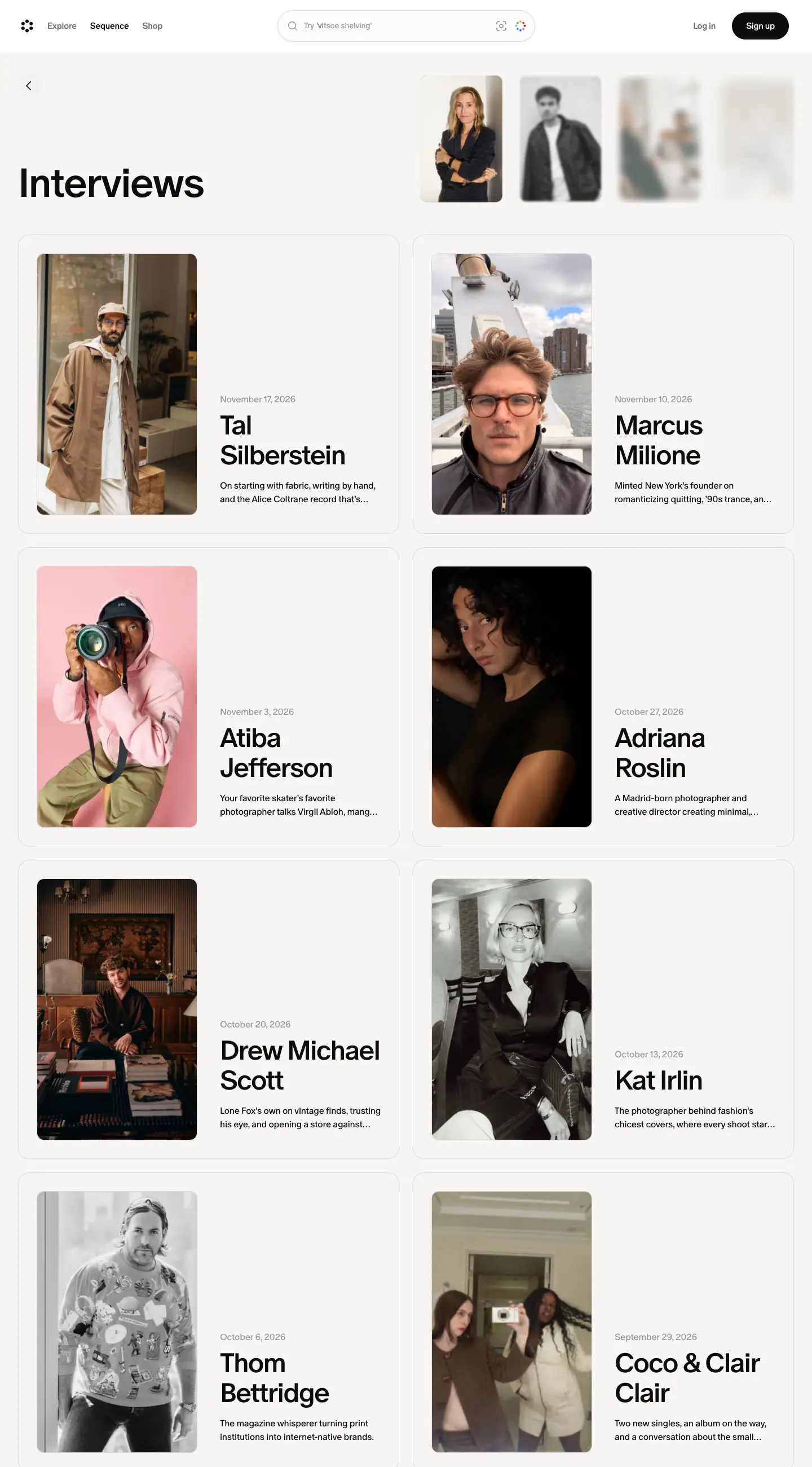
- Environmental portraits in natural light (a founder in his shop, a menswear founder on a boat against the Manhattan skyline).
- Studio portraits on saturated paper backdrops (a photographer in pink with a camera, against pink).
- Black-and-white archival photography for culture stories (fisheye skate shots, 1980s hardcore shows).
- Portraits are always vertical, framed with padding inside a white or tinted card.
Why: The pictures signal "culture magazine", not "SaaS blog". Vertical portraits inside matted cards echo printed magazine layouts.
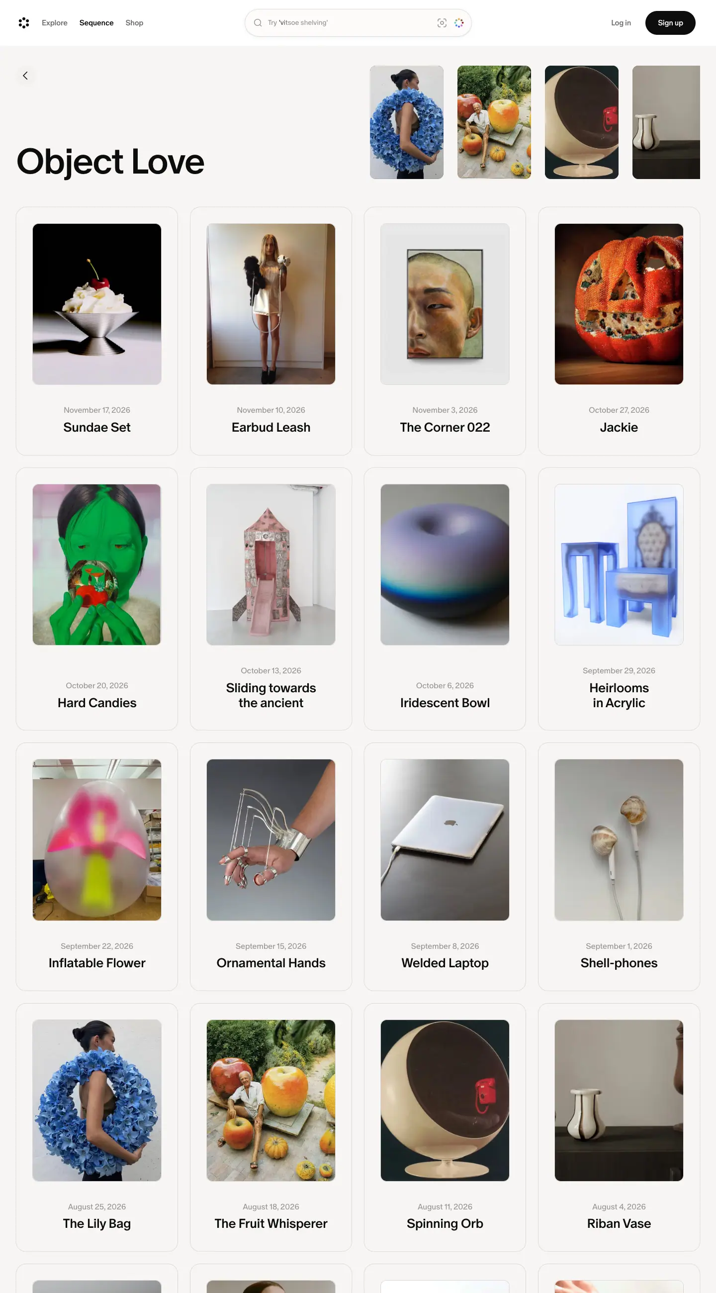
4. Still-life objects: the Object Love look
Where: Object Love posts and cards.
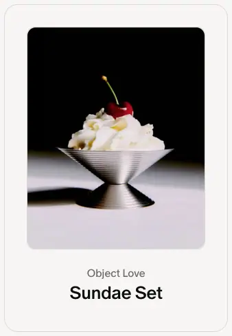
What it looks like: A single object on a seamless backdrop of one colour, studio-lit with hard shadows. Examples: a steel sundae cup with a cherry on black; a melting candle on red; a lamp on white. The subject is centred with lots of empty space around it.
Why: It mirrors the product's core action (saving a single beautiful thing) as a photographic genre.
Collage as a graphic device
- Home hero: ≈50 rotated photo tiles floating in depth on a canvas, some blurred.
- Hero headline chips: two 70px thumbnails tilted ±6°, overlapping, like photos tucked into a notebook.
- Aesthetic Study header: five images fanned and overlapping across the column width (crop).
- Collection and creator cards: 3-image strips that act as a mini mood board.
- Sequence masthead: scattered, partly blurred portraits.
Why: A mood board is the product, so collage is the brand's native graphic language. Cosmos needs no illustration.
Logo and marks
| Mark |
Description |
Where |
| Flower mark |
Six solid black dots in a ring (a hexagonal "flower") with an empty centre. 32 × 32px in the header. |
Header top-left, QR centre, favicon |
| Wordmark |
COSMOS in wide grotesque caps with tight spacing, ≈100 × 17px |
Header centre on marketing pages, compact footer |
| Colour dot ring |
Eight coloured dots (green, amber, brown, crimson, violet, blue, cyan …) in the same ring arrangement |
The visual-search button next to every search field |
| 404 dots |
Five dots: a group of four plus one apart. The dot-wave-1/2/3 keyframes fade dots in and out in sequence. |
Content-not-found page, likely also loading |
| Sequence nameplate |
SEQUENCE set at 88px 700 caps with a small flower glyph as an asterisk |
/sequence |
| Public Work |
"P.W°", a monogram with a degree sign |
/public-work |


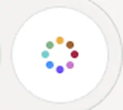
Why the dot system works: One simple geometric idea (dots in a ring) produces the logo, the "similar images" button in colour, a loader and a 404 mark. The colour version appears only where the product does something with colour or similarity, so colour keeps a meaning.
Iconography
- Thin outline icons at 1.5px ≈ stroke weight: search magnifier, chevrons, close ×, sort arrows.
- Platform glyphs (Apple, Google Play) appear only in app CTAs.
- No emoji, no illustrated spot icons, no 3D renders, no gradients behind icons.
What Cosmos never does
- No brand colour fields, gradient meshes, glows, or noise textures in the interface.
- No device mock-ups. Feature demos are bare UI fragments on paper tiles.
- No stock photography of people at laptops.
- No illustration.
How to brief this art direction
"Gallery-wall neutral UI on warm paper and white. All colour comes from curated photography: archival scans, film grain, studio still lifes on single-colour backdrops, and environmental editorial portraits. Images keep their natural crop with 3px corners in grids; editorial images sit matted inside 20px cards. Use collage (tilted, overlapping, floating photos) as the only graphic device. Logo: a ring of six dots."
10 · Brand assets and graphics inventory
This is every distinct graphic or asset type on the public site, with a crop, how it is made, and how to rebuild it. Crops are PNGs cut from the 1440px screenshots (folder images/assets/). No SVG was downloaded.
| # |
Asset |
Crop |
How Cosmos makes it |
How to recreate it |
| 1 |
Flower mark |
|
Six solid dots on a ring, rendered as an inline vector, 32 × 32 |
6 circles of ≈5px diameter on a ≈20px ring, 60° apart, centre empty, #0d0d0d |
| 2 |
Wordmark COSMOS |
|
Drawn caps lettering, 100 × 17 |
Wide grotesque caps, tight tracking; for a mock-up, Oracle Bold caps at -2% |
| 3 |
Colour dot ring |
|
8 coloured dots on a ring inside a 64px white circle |
Same ring geometry as the mark with 8 hues; use it only for colour or similarity features |
| 4 |
404 / loader dots |
|
5 dots. The CSS also defines dot-wave-1/2/3 opacity keyframes, likely for a dot loader; they were not seen running on the 404 |
3 keyframes with staggered 0 → 1 → 0 opacity windows (0–10 % off, 20–80 % on …) |
| 5 |
Sequence nameplate |
 |
Live text, 88px 700 caps -5%, plus a small flower glyph |
Same type settings; put the logo mark at cap height, 0.25em ≈ in size |
| 6 |
Floating photo canvas |
|
<canvas> 1440 × 900 drawing rotated rounded image tiles with depth blur and drift |
Three.js or 2D canvas: ≈50 tiles, random rotation ±30°, depth 0–1 controls scale, blur and opacity, slow drift, mouse parallax |
| 7 |
Tilted thumbnail chips |
|
70px <img> in a 16px-radius frame, rotate(±6deg), overlapping |
Two <span>s with transform: rotate(-6deg) and rotate(6deg), -12px ≈ overlap |
| 8 |
Feature demo video tiles |
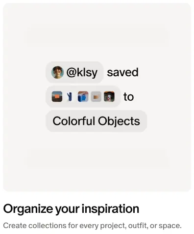 |
Muted looping <video> of real UI fragments on a #f7f5f3 12px tile |
Record UI states as 384px-square video; no device frame |
| 9 |
Phone fragment |
|
A white panel with only the top corners rounded (24px 24px 0 0), cut off by the tile edge |
border-radius: 24px 24px 0 0 plus overflow: hidden on the tile |
| 10 |
Brand list type |
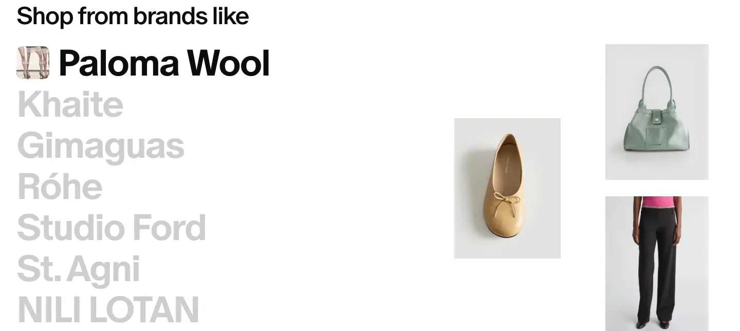 |
Live text, 72px, active #0d0d0d, others #d0cdcd, auto-cycled |
JS interval ≈3s that toggles an .active class; transition color |
| 11 |
Logo marquee |
|
Two rows of grey partner logos, marquee-left / marquee-right 56s linear |
Duplicate each row's content; animate translateX(0 → -50%) and the reverse |
| 12 |
Creator card collage |
|
3 images in a strip + overlapping round avatar |
3-column grid, aspect-ratio: 1; avatar with margin-top: -50% ≈ and a white 4px ring |
| 13 |
Collection collage |
|
3 images side by side, rounded outer corners |
display: grid; grid-template-columns: 1fr 1fr 1fr; border-radius: 12px; overflow: hidden |
| 14 |
QR app card |
|
Dotted-module QR code with round finder eyes and the flower mark in the centre, white card, radius 25% |
Use a QR library that draws dot modules; overlay the logo; border-radius: 25% |
| 15 |
Search pill |
|
Frosted shell + white well + colour-dot button |
See 08 components |
| 16 |
Image-tinted card |
|
Card background sampled from the photo |
Extract the dominant colour (Vibrant.js, fast-average-color) on the server; pick text colour by luminance |
| 17 |
Featured edition |
|
Full photo, 24px radius, 72px white title |
Add a bottom-left scrim if the photo is bright |
| 18 |
Brand hero |
|
8px inset, 40px radius, top and bottom scrims, brand logo lockup |
margin: 8px; border-radius: 40px; overflow: clip, two linear-gradient overlays |
| 19 |
Brand banner |
|
Campaign photo with the brand's logo in white |
Brand-supplied logo PNG over the photo |
| 20 |
Product packshot |
|
Grey seamless studio photos, 4px radius |
Ask brands for consistent backgrounds, or normalise with background removal |
| 21 |
Study collage |
|
5 overlapping images, varied heights |
Flex row with negative margins and slight z-index stagger |
| 22 |
Team photo strip |
|
8 candid team photos in a row |
Square crops, small radius, optional slow scroll-left |
| 23 |
Public Work canvas + popover |
|
Pannable canvas of public-domain scans, a "P.W°" info popover |
Infinite canvas library + floating white card, radius ≈24px |
| 24 |
Header paper fade |
|
Gradient from #f7f5f3 to transparent behind the sticky header |
background: linear-gradient(#f7f5f3 0 15%, rgb(247 245 243/.92) 26%, transparent) |
Asset principles
- Geometry over drawing. Every Cosmos-made graphic is dots, circles, pills or rectangles. Nothing is hand-drawn or illustrated.
- Photos are the only texture. There are no noise, grain or gradient backgrounds. Grain comes from the film photos people save.
- Colour has a job. The 8-colour dot ring appears only on colour and similarity features.
#0700ff appears only on links and sale prices.
- The logo works as a pattern. The dot ring scales from a 32px favicon to a QR centre to a loader.
11 · Motion and interaction
Measured with getComputedStyle on every element (transition and animation histograms in data/<page>.probe.json), all @keyframes rules in the loaded stylesheets, scripted hovers, and timed screenshots.
Timing and easing tokens
| Token |
Value |
--default-transition-duration |
150ms |
--default-transition-timing-function / --ease-in-out |
cubic-bezier(0.4, 0, 0.2, 1) |
--ease-out |
cubic-bezier(0, 0, 0.2, 1) |
--ease-out-quint (--tw-ease) |
cubic-bezier(0.22, 1, 0.36, 1) |
| Canvas entrance easing |
cubic-bezier(0.16, 1, 0.3, 1) (expo-out) |
Transitions by frequency (home)
| Properties |
Duration |
Easing |
Count |
Used for |
| transform, translate, scale, rotate |
400ms |
ease-out |
54 |
carousel items, chips, cards |
| all |
150ms |
in-out |
28 |
buttons, links |
| opacity, filter, scale |
500ms |
in-out |
21 |
blur-in reveals |
| color, background-color, border-color … |
150ms |
in-out |
8 |
text links |
| grid-template-rows, opacity |
700ms |
in-out |
8 |
expanding rows (accordion-style height animation via grid rows) |
| filter, scale |
700ms |
in-out |
8 |
image focus pulls |
| color … |
200ms |
in-out / ease-out |
9 |
nav and tabs |
| width, margin-right |
400ms |
in-out |
7 |
the rotating headline word re-measuring its width |
| max-width, color |
200ms ease-out, 150ms |
— |
1 |
search placeholder keyword |
| --fade-top/bottom/left-intensity |
200ms |
ease |
2 |
scroll-edge fade masks on carousels |
| opacity |
1.25s |
ease-out |
1 |
slow fade (hero layer) |
On Sequence the main values are 300ms transforms and colours. On Shop they are 200ms transforms.
Keyframes found
| Name |
Definition |
Use |
hero-enter |
from scale(0.95) |
Home hero on load, 0.5s ease (running) |
canvas-enter |
opacity 0, blur 20px, scale 0.8 → 1, sharp |
Public Work canvas, 1.8s expo-out (running) |
enter |
opacity 0 + blur 2px → visible |
Generic content entrance |
fade-in |
0 → 1 opacity |
0.15s ease; 73 elements on Explore, 88 on Shop (each image as it loads) |
scale-in |
opacity 0, scale 0.95 → 1 |
Popovers, 0.2s ease |
slide-in, similar-elements-enter |
opacity 0, translateY 24px → 0 |
Lists, the "similar" panel |
see-similar-button |
opacity 0, blur 4px, scale 0.8, translateY 40px → in |
The "See similar" floating button |
element-view |
opacity 0, scale 1.01 → 1 |
Opening an element |
sequence-card-image-reveal |
opacity 0, blur 18px, scale 1.035 → visible, scale 1.015 |
Sequence card images |
sequence-hero-strip-image-in/out, -shape-swap |
cross-fade plus a blur-18px/scale-1.055 pulse at 50% |
The masthead thumbnail strip swapping images |
summer-hero-in |
opacity 0, blur 18px, translateY 10px → in |
A seasonal hero |
marquee-left / marquee-right |
translate 0 ↔ -50% |
Logo wall, 56s linear infinite (running) |
scroll-left |
translate 0 → -505px |
Photo strips |
*_mask-shimmer, *_text-shimmer, shimmer-sweep |
mask or background-position sweep |
"Loading" or "thinking" text, 1.9s and 3s linear infinite |
dot-wave-1/2/3 |
staggered opacity windows |
A 3-dot loader |
_loader-shift |
dots translate along a vector |
The dot-ring loader (the logo as a spinner) |
snake-border |
stroke-dashoffset 0 → -16px |
Marching-ants dashed border (drop zone) |
ext-border-glow-spin / -fade |
an animated conic angle custom property |
A glowing border for the browser-extension promo |
pulse, spin |
Tailwind defaults |
Skeletons, spinners |
hover-sentinel |
animates a custom property 0 → 1 |
A trick for detecting hover support in CSS |
The signature: many entrances use blur → sharp: 2px for content, 4px for buttons, 18px for images, 20px for the canvas. Images "come into focus" instead of sliding in.
Measured interactions
| Interaction |
Before |
After |
How measured |
| Hover "Sign up" |
#0d0d0d |
#232323 |
scripted hover, computed background |
| Hover nav link "Explore", "Log in" |
#6e6a69 |
#0d0d0d |
scripted hover, computed colour |
| Hover Sequence story card |
transparent card, image scale: none |
card #fcfbfa, image scale: 1.02 over 300ms |
mouse move over the card |
| Hover Explore image |
plain |
40% #0d0d0d overlay + white "Save" pill (65 × 34) at top-right |
screenshot explore-tile-hover |
| Home headline |
— |
phrase changes every ≈3s with a 3D flip: perspective, backface-visibility: hidden, filter: blur(0px) on the flipping element; the line's width animates (width, margin-right 400ms) |
6 timed frames below |
| Home brand list |
"Paloma Wool" active |
another brand active after ≤3s; the active slot can show brands not in the static list |
timed reads of color |
| Header over content |
— |
content fades under the paper gradient; the header has no background or blur |
screenshot |
Hero rotation frames (≈1.6s apart)
Frame 4 caught the change in progress: the DOM held both "go-to outfit" and "art obsession" at once, which shows a cross-flip between two stacked faces.
What could not be measured
- Canvas physics. Tile drift speed, rotation, parallax and depth-of-field on the home hero are computed in JavaScript and drawn to
<canvas>. Only frames are recorded.
- Exact rotation interval. ≈3s, from frame timing. The JavaScript timer was not read.
- Reduced motion. The CSS has a
(prefers-reduced-motion: reduce) block. Its effect on the canvas and the headline was not tested.
Why this motion fits
- Blur-to-focus matches a photo product: it feels like a lens.
- Short UI transitions (150ms) and longer content transitions (300–700ms) keep controls responsive while content arrives gently.
- Scale 1.02 on hover is small enough to suggest "pick me up" without a jump.
- Infinite but slow (56s marquees, ≈3s rotations) adds life to the page without demanding attention.
12 · Glossary
Terms to use when you brief, design or build a page in this style. Each one points to where Cosmos does it.
Layout and structure
| Term |
Meaning |
Cosmos example |
| Gallery-wall layout |
Content runs edge to edge inside a small gutter, with no centred container |
32px gutters, 1376px content on a 1440px screen |
| Masonry grid |
Columns of images with natural heights, packed vertically |
Explore, search, 5 columns of 248px |
| Matted card |
An image inset inside a padded card, like a photo in a mount |
Sequence story cards: 258px image in a 326px card |
| Light bento |
A grid row that mixes card sizes (2-wide + 1 + 1) |
"This week in Sequence" |
| Horizontal carousel with peek |
A row wider than the screen; the next card is cut off at the edge |
Home feature cards, creator cards |
| Edge fade mask |
A gradient mask that fades a scroller at its edges |
--fade-left/right-intensity on carousels |
| Reading column / measure |
A narrow column sized for 60–75 characters per line |
620px article column |
| Inset hero |
A hero card inset a few pixels from the viewport with a large radius |
Brand hero: 8px inset, 40px radius |
| Sticky transparent header |
A header with no background that stays on top |
92px, position: sticky |
| Header fade / scrim |
A gradient behind the header or on a photo to keep text readable |
Paper fade; 47% black top scrim on brand photos |
Type
| Term |
Meaning |
Cosmos example |
| Grotesque |
A sans-serif with 19th–20th-century roots, neutral and slightly irregular |
ABC Oracle |
| Single-family system |
One typeface for everything, with hierarchy from size, weight and colour |
cosmosOracle everywhere |
| Negative tracking |
Letter-spacing below zero |
-2% body, -3 to -5% display |
| Solid / sub-1 leading |
Line height at or below 1.0 |
Hero line 2 at 0.8 |
| Nameplate / masthead |
The publication's title set as a logo |
SEQUENCE |
| Dek |
The one-sentence summary under a headline |
"Ancient architecture meets the post-dinner sweet tooth …" |
| Run-in head |
A bold first sentence that starts a paragraph |
Edition microdose items |
| Meta line |
Date · category above a title |
"November 17, 2026 · Object Love" |
| Type as index |
A list of names set at display size as the main graphic |
"Shop from brands like" |
| Rotating headline / word swap |
One slot in a headline that cycles through phrases |
"Find your next ___" |
Colour and surface
| Term |
Meaning |
Cosmos example |
| Content-led colour |
The UI is neutral; images provide all colour |
The whole site |
| Warm greys |
Greys with a slight red or yellow cast |
#6e6a69, #9a9796, #f7f5f3 |
| Paper background |
Off-white for reading surfaces |
#f7f5f3 |
| Grey ramp hierarchy |
Primary, secondary, tertiary and quaternary text greys |
#0d0d0d → #6e6a69 → #9a9796 → #d0cdcd |
| Hairline ring |
A 0.5px box-shadow ring used instead of a border |
0 0 0 .5px rgb(13 13 13/.12) |
| Inset highlight |
An inner top shadow in white to suggest a soft material |
Search shell |
| Frosted pill |
A semi-transparent pill over content |
Search shell at 90% opacity |
| Image-derived tint |
A card colour sampled from its photo |
Interview feature cards |
| Signal colour |
A single saturated colour kept for links and offers |
#0700ff |
| Light-dark tokens |
Paired light and dark values per semantic role |
--light-text-primary / --dark-text-primary |
Components
| Term |
Meaning |
| Pill button |
Fully rounded button (rounded-full) |
| Ghost button |
Text-only button with no fill |
| Search-first hero |
A hero whose main action is a working search field |
| Visual search |
Search by image, the colour-dot button |
| Follow card |
A profile card with a follow action |
| Collection collage |
3 images side by side as a cover for a set |
| Shelf |
A titled horizontal row of products |
| Filter pills |
Dropdown or toggle filters drawn as pills |
| QR handoff card |
A desktop card that sends the user to the mobile app |
| Sign-up wall / soft gate |
A modal that blocks content after some browsing |
| Empty state |
The design for "nothing here" (the 404 dots) |
Motion
| Term |
Meaning |
Cosmos example |
| Blur-in / focus pull |
An entrance from blurred to sharp |
enter, sequence-card-image-reveal (18px) |
| Scale-in |
An entrance from 95% scale |
scale-in, hero-enter |
| Hover lift / zoom |
A small scale on hover |
Story image scale: 1.02 |
| Marquee |
An infinite horizontal scroll |
Logo wall, 56s |
| 3D flip text |
A word swap using perspective and backface hiding |
Hero headline |
| Ambient canvas |
A background animation drawn on <canvas> |
Floating photo tiles |
| Shimmer |
A moving highlight across text or a mask, for loading |
text-shimmer 3s |
| Expo-out |
Fast-start, long-tail easing |
cubic-bezier(.16,1,.3,1) |
Art direction
| Term |
Meaning |
| Archive aesthetic |
Scans, film grain, museum objects, type specimens |
| Still life on seamless |
One object on a single-colour backdrop |
| Environmental portrait |
A person photographed in their own place |
| Packshot |
A product on a plain background |
| Collage / mood board |
Overlapping, tilted images as a graphic device |
13 · Build recipe
These are paste-ready tokens and components that reproduce the measured Cosmos look. The values come from docs 02–11. Swap the font for a licensed copy of ABC Oracle, or use Geist as a free substitute.
1. Tokens
@font-face { font-family: "Display"; src: url(/fonts/oracle-regular.woff2) format("woff2"); font-weight: 400; font-display: swap; }
@font-face { font-family: "Display"; src: url(/fonts/oracle-medium.woff2) format("woff2"); font-weight: 500; font-display: swap; }
@font-face { font-family: "Display"; src: url(/fonts/oracle-bold.woff2) format("woff2"); font-weight: 700; font-display: swap; }
/* Free substitute: font-family: "Geist", "Inter Tight", Arial, sans-serif; */

:root {
  /* neutrals (warm) */
  --ink: #0d0d0d;          /* text-primary, button-primary */
  --ink-hover: #232323;    /* hover-primary */
  --text-2: #6e6a69;       /* secondary */
  --text-3: #9a9796;       /* tertiary: dates, footer links */
  --text-4: #d0cdcd;       /* quaternary: inactive list items */
  --fill-2: #f2f1f0;       /* secondary button, active tab */
  --fill-2-hover: #e8e6e4;
  --paper: #f7f5f3;        /* reading surfaces, footer */
  --card-hover: #fcfbfa;
  --white: #ffffff;
  --signal: #0700ff;       /* links, sale prices only */
  --critical: #bd3c1f;
  --ring: rgb(13 13 13 / .12);
  --overlay: rgb(13 13 13 / .4);

  /* type */
  --font: "Display", "Geist", Arial, sans-serif;
  --track: -0.02em;        /* default for everything */
  --track-display: -0.03em;

  /* radius */
  --r-pill: calc(infinity * 1px);
  --r-image: 3px;  --r-product: 4px;  --r-media: 12px;
  --r-card: 20px;  --r-feature: 24px; --r-hero: 40px;

  /* layout */
  --gutter: 32px; --gap: 24px; --section: 128px; --title-gap: 32px;
  --header-h: 92px; --measure: 620px;

  /* motion */
  --ease-in-out: cubic-bezier(.4, 0, .2, 1);
  --ease-out: cubic-bezier(0, 0, .2, 1);
  --ease-expo: cubic-bezier(.16, 1, .3, 1);
  --fast: 150ms; --med: 300ms; --slow: 500ms;
}

html { -webkit-font-smoothing: antialiased; }
body { margin: 0; background: var(--white); color: var(--ink); font: 400 16px/1.4 var(--font); letter-spacing: var(--track); }
.paper { background: var(--paper); }
2. Type scale
.t-masthead { font: 700 88px/1.5 var(--font); letter-spacing: -0.05em; text-transform: uppercase; }
.t-display  { font: 700 72px/1 var(--font);   letter-spacing: -0.04em; }
.t-display-tight { line-height: .8; }                       /* poster lines */
.t-index    { font: 500 72px/1 var(--font);   letter-spacing: var(--track-display); }
.t-h2       { font: 500 48px/1 var(--font);   letter-spacing: -0.04em; }
.t-article-title { font: 700 48px/1 var(--font); letter-spacing: var(--track-display); }
.t-row      { font: 500 32px/1.1 var(--font); letter-spacing: var(--track-display); }
.t-card     { font: 500 26px/1.15 var(--font); }
.t-meta     { font: 500 20px/1.15 var(--font); color: var(--text-2); }
.t-article  { font: 400 20px/1.6 var(--font); }            /* 20/32 */
.t-article b:first-child { font-weight: 700; }             /* run-in lead */
.t-body     { font: 400 16px/1.4 var(--font); }
.t-small    { font: 400 14px/1.4 var(--font); color: var(--text-3); }
.t-legal    { font: 350 16px/1.5 var(--font); }
3. Header
.header { position: sticky; top: 0; z-index: 200; height: var(--header-h);
  display: grid; grid-template-columns: 1fr auto 1fr; align-items: center; padding: 0 var(--gutter); }
.header::before { content: ""; position: absolute; inset: 0 0 -40px; z-index: -1; pointer-events: none;
  background: linear-gradient(var(--paper) 0 15%, rgb(247 245 243 / .92) 26%, transparent); }
.nav a { font: 500 15px/22px var(--font); color: var(--text-2); transition: color var(--fast) var(--ease-in-out); }
.nav a:hover { color: var(--ink); }
4. Buttons
.btn { display: inline-flex; align-items: center; height: 48px; padding: 0 24px; border-radius: var(--r-pill);
  font: 500 15px/1 var(--font); letter-spacing: -0.28px; border: 0; cursor: pointer;
  transition: background-color var(--fast) var(--ease-in-out), color var(--fast) var(--ease-in-out); }
.btn-primary   { background: var(--ink); color: #fff; }
.btn-primary:hover { background: var(--ink-hover); }
.btn-secondary { background: var(--fill-2); color: var(--ink); }
.btn-secondary:hover { background: var(--fill-2-hover); }
.btn-ghost     { background: transparent; color: var(--text-2); }
.btn-ghost:hover { color: var(--ink); }
.btn-lg { height: 56px; font-size: 16px; font-weight: 700; }
.btn-sm { height: 40px; padding: 0 20px; font-size: 14px; }
.btn-icon { width: 32px; height: 32px; padding: 0; justify-content: center; background: var(--card-hover);
  box-shadow: 0 0 0 1px var(--ring), 0 3px 12px rgb(0 0 0 / .05); }
5. Search pill (hero)
<form class="search-shell">
  <label class="search-well"><svg class="i-search"/><input placeholder="Search for typefaces"></label>
  <button class="search-visual" aria-label="Visual search"><!-- 8-dot ring --></button>
</form>
.search-shell { display: flex; gap: 8px; width: 640px; padding: 8px; border-radius: var(--r-pill);
  background: rgb(242 241 240 / .9); box-shadow: 0 0 0 1px var(--ring),
  inset 0 1px 1.5px rgb(255 255 255 / .7), inset 0 -1px 1.5px rgb(0 0 0 / .03); }
.search-well { flex: 1; height: 64px; display: flex; align-items: center; gap: 12px; padding: 0 12px 0 20px;
  background: #fff; border-radius: var(--r-pill); box-shadow: 0 0 0 1px var(--ring); }
.search-well input { border: 0; outline: 0; font: 400 20px/23px var(--font); letter-spacing: var(--track); width: 100%; }
.search-well input::placeholder { color: var(--text-3); }
.search-visual { width: 64px; height: 64px; border-radius: 50%; background: #fff; box-shadow: 0 0 0 1px var(--ring); }
6. Story card (Sequence)
.story { display: grid; gap: 12px; padding: 34px 34px 24px; border-radius: var(--r-card); background: #fff;
  box-shadow: 0 0 0 .5px var(--ring); text-align: center; transition: background-color var(--med) var(--ease-in-out); }
.story img { width: 100%; aspect-ratio: 258/340; object-fit: cover; border-radius: var(--r-media);
  transition: scale var(--med) var(--ease-out); }
.story:hover { background: var(--card-hover); }
.story:hover img { scale: 1.02; }
.story .cat { font: 400 16px/1.4 var(--font); color: var(--text-2); }
.story h3 { font: 500 26px/1.15 var(--font); margin: 0; }
.row { display: grid; grid-template-columns: repeat(4, 1fr); gap: var(--gap); padding: 0 var(--gutter); }
.row .feature { grid-column: span 2; }
7. Masonry image grid with hover save
.masonry { columns: 5 248px; column-gap: 33px; padding: 0 var(--gutter); }
.tile { position: relative; break-inside: avoid; margin-bottom: 33px; }
.tile img { width: 100%; display: block; border-radius: var(--r-image); }
.tile::after { content: ""; position: absolute; inset: 0; border-radius: var(--r-image); background: var(--overlay);
  opacity: 0; transition: opacity var(--fast) var(--ease-in-out); }
.tile .save { position: absolute; top: 12px; right: 12px; z-index: 1; opacity: 0; height: 34px; padding: 0 16px;
  border-radius: var(--r-pill); background: #fff; font: 500 14px/34px var(--font); }
.tile:hover::after, .tile:hover .save { opacity: 1; }
8. Rotating headline
<h1 class="t-display hero-h1">Find your next<br>
  <span class="swap"><span class="face" data-i="0">dream font</span><span class="face" data-i="1">lamp with character</span></span>
  <span class="chips"><img class="chip a"><img class="chip b"></span>
</h1>
.swap { display: inline-grid; perspective: 600px; transition: width 400ms var(--ease-in-out); }
.face { grid-area: 1/1; backface-visibility: hidden; transition: transform 500ms var(--ease-expo), opacity 300ms, filter 300ms; }
.face[aria-hidden="true"] { transform: rotateX(90deg); opacity: 0; filter: blur(4px); }
.chip { width: 70px; height: 70px; border-radius: 16px; object-fit: cover; background: var(--fill-2); }
.chip.a { rotate: -6deg; } .chip.b { rotate: 6deg; margin-left: -14px; }
@media (prefers-reduced-motion: reduce) { .face { transition: none; } }
Change aria-hidden on the faces every 3000ms with JS. Update the search placeholder keyword at the same time.
9. Blur-in entrance
@keyframes enter { from { opacity: 0; filter: blur(2px); } }
@keyframes reveal-image { from { opacity: 0; filter: blur(18px); scale: 1.035; } to { scale: 1.015; } }
.enter { animation: enter 500ms var(--ease-in-out) both; }
.reveal-image { animation: reveal-image 700ms var(--ease-in-out) both; }
@keyframes marquee { to { translate: -50%; } }
.marquee > div { display: flex; width: max-content; animation: marquee 56s linear infinite; }
.marquee.reverse > div { animation-direction: reverse; }
10. Page skeletons
| Page |
Structure |
| Landing |
header → 100vh hero (canvas + rotating H1 + search + CTA) → feature carousel → type-index list → people carousel → logo marquee → paper footer CTA |
| Product browse |
header with search → pill tabs → collection carousel → 5-column masonry |
| Editorial hub |
header → nameplate + Subscribe → rows of "title + See all + 4-col cards" → newsletter CTA → compact footer |
| Article |
back chevron → meta line → 48px title → dek → hairline → 620px body → "More from …" (2 cards) → CTA → compact footer |
Checklist before you ship a page in this style
- [ ] Only neutrals in the chrome; the photos carry the colour.
- [ ] One typeface; tracking -2% or tighter everywhere.
- [ ] Pills for actions, 20px cards for stories, 3–4px for raw images.
- [ ] 32px gutters, 24px gaps, 128px between sections.
- [ ] Tertiary grey only on non-essential metadata (it fails AA at 2.9:1).
- [ ] Real
<h1> on article pages (Cosmos uses a <p>).
- [ ] Text on image-tinted cards chosen by luminance.
- [ ] Reduced-motion fallback for the canvas and the headline swap.
Home · cosmos.so/
Job: Turn a visitor who heard "Cosmos is like Pinterest for designers" into a sign-up, or on a phone into an app install. The page is 3,661px tall: one viewport of hero, then five short sections.
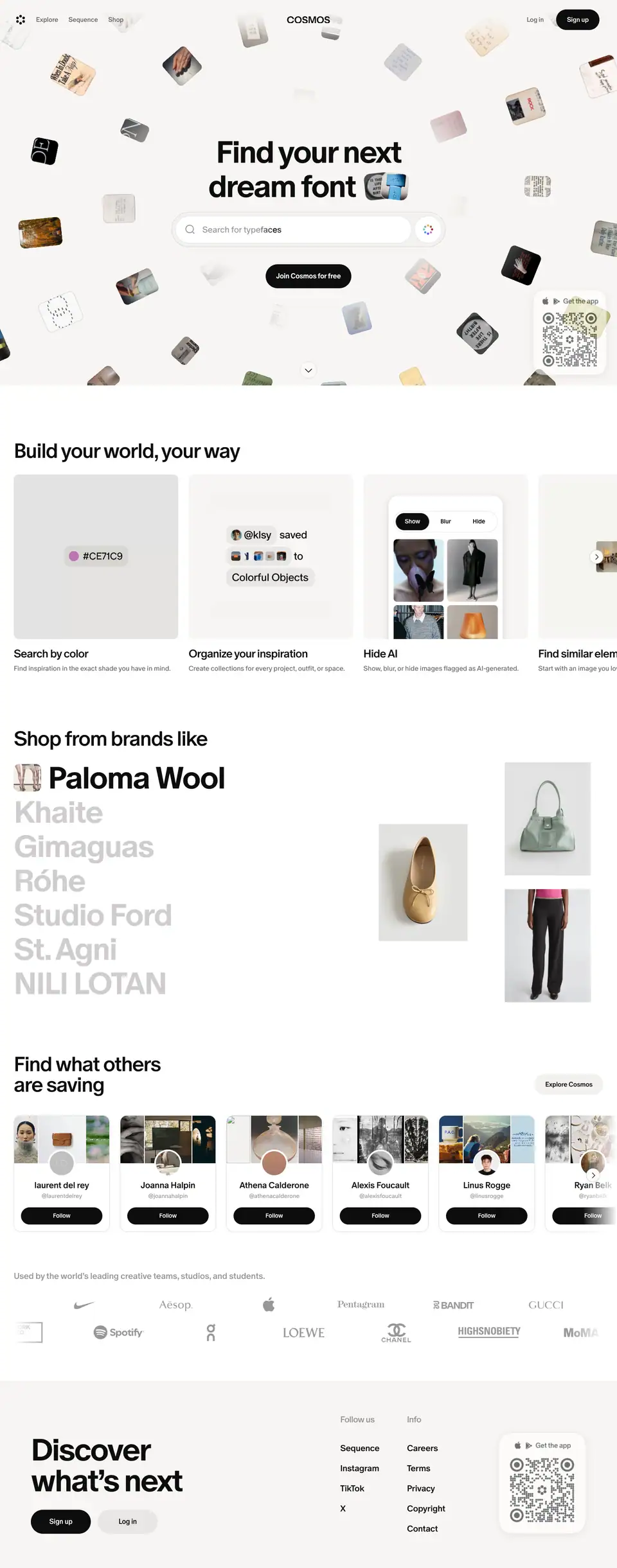
Section by section
1. Hero (0–900px)
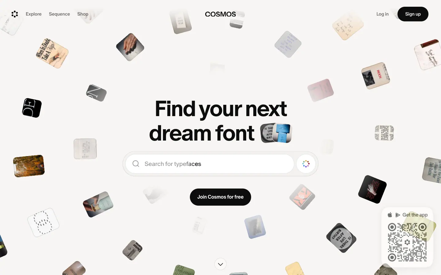
| Element |
Measured |
| Background |
#f7f5f3 paper, plus a full-viewport <canvas> of ≈50 floating photo tiles |
| Header |
Transparent, 92px: flower mark + Explore / Sequence / Shop at left, COSMOS at centre, Log in / Sign up at right |
| H1 |
"Find your next / [rotating phrase]": 72px, 700, -2.88px, centred in a 1200px block |
| Rotating phrases |
dream font, lamp with character, go-to outfit, art obsession, forever chair, shoot reference (≈3s each) |
| Thumbnail chips |
2 × 70px, radius 16, ±6° tilt, after the phrase |
| Search |
640 × 82 frosted shell, white 552 × 64 input, visual-search dot button. The placeholder keyword matches the headline. |
| CTA |
"Join Cosmos for free", 201 × 56 black pill, 16px 700 |
| QR card |
176 × 204, bottom-right, "Get the app" |
| Scroll cue |
40px ≈ round chevron, bottom centre |
Why: In one screen the visitor sees what Cosmos holds (the image cloud), what they can do (search) and what to do next (join). The rotating phrase cycles through audiences (type designers, interior lovers, stylists, photographers) without a "for X, Y and Z" list.
2. "Build your world, your way" (1028–1572)
- H2 48px 500 at x 32. Six feature cards (384 × 464) in a horizontal scroller with a chevron.
- Each card holds a looping muted video of real UI on a
#f7f5f3 12px tile, a 26px title and a 16px grey line.
- Why: These are feature demos without device frames: the UI fragment is the illustration. Six features in one row keep the page short.
3. "Shop from brands like" (1700–2332)
- 7 brand names at 72px 700, 80px pitch. The active one is black with a photo chip; the others are
#d0cdcd. The list auto-cycles, and the right side shows a 3-product collage for the active brand.
- Why: It sells Shop with fashion-credible names set as a magazine index, not as small logos.
4. "Find what others are saving" (2460–2876)
- 2-line H2 with an "Explore Cosmos" secondary pill at right. Creator cards (224 × 272, radius 16) with a 3-image strip, avatar, name, handle and a Follow pill. The row fades at the right edge.
- Why: The social proof is real curators and their boards. It shows the community and the product at once.
5. Logo marquee (2968–3143)
- A grey 20px caption, then two rows of grey logos moving in opposite directions (56s loops).
6. Footer CTA (3223–3661)
#f7f5f3 block, padding: 80px 72px. "Discover what's next" (72px 700), Sign up + Log in pills, "Follow us" / "Info" link columns, and the QR card.- Why: "Discover what's next" closes the "Find your next" loop that the hero opened.
Mobile (390px)
- H1 drops to 32 / 32px. The CTA becomes "Download app" with an Apple logo. The header shows a "Download" pill and a menu icon.
- The carousels keep their horizontal scroll with a peek of the next card. The brand list stays a stacked type list at a smaller size.
What to steal
- A "Find your next ___" headline that cycles through real use cases.
- A working search in the hero.
- Brand names as display type instead of a logo row.
- A closing CTA that echoes the hero's words.
Explore · cosmos.so/explore
Job: Let a logged-out visitor use the real product: browse curated collections and an endless masonry of saved "elements". 17 category tabs each have their own URL (/explore/fashion, /explore/typography …). See public pages.
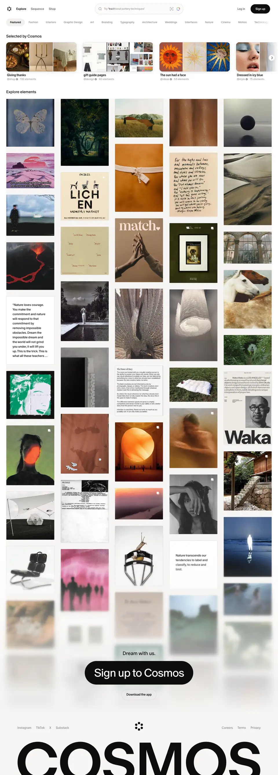
Sections
1. Header with search + tabs

- The header centre becomes a 457 × 56 search pill (
#fcfbfa, 1px ring at 12%), with a rotating "Try 'traditional pottery techniques'" placeholder plus image-search and visual-search buttons.
- 18 pill tabs (40px tall, padding 10 × 20, 14px 500) start at x 32 and scroll horizontally. The active tab ("Featured") is
#0d0d0d; the rest are #9a9796.
- There is no hero. Content starts at y 176.
2. "Selected by Cosmos" (y 176)

- A section label at 20px 400 (product pages use a lighter label than marketing pages).
- Collection cards ≈255px wide with a 3-image collage, title (16px 500), and "@shop ✓ · 132 elements" (14px
#9a9796). They scroll horizontally with a chevron button (32px round, #fcfbfa, ring + soft shadow).
3. "Explore elements" masonry (y 464 →)
- 5 columns, 248px images, ≈33.5px gaps, radius 3px. Images keep their natural ratios. Quote "elements" appear as white text cards in the same flow.
- Each image fades in on load (
fade-in, 0.15s ease; 73 instances).
- Hover: 40%
#0d0d0d overlay and a white "Save" pill (65 × 34) at top-right.
- A "Sign up to Cosmos" black pill floats at the bottom of the masonry (full page), followed by a giant
COSMOS wordmark footer band.
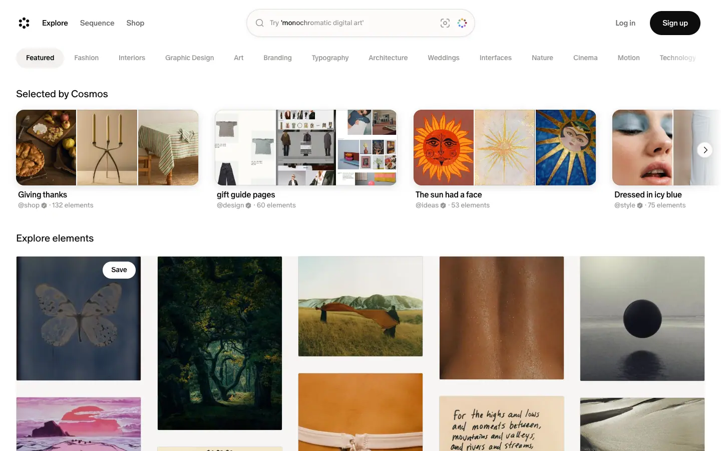
Why it is designed this way
- No hero: the masonry is the pitch. A visitor from Google lands on real content within 200px.
- Category tabs as pills: the categories read as filters on one surface, so the visitor keeps browsing instead of navigating away.
- 3px corners and natural ratios: these respect each image as it was saved. This is the "archive" voice of the product.
- Section labels at weight 400: quieter than marketing H2s, because the images are the headline here.
Mobile
The 390px capture shows the search, tabs and one collection card. The masonry lazy-loads only in view, so the capture shows grey placeholders (mobile).
Shop · cosmos.so/explore/shop
Job: Show that Cosmos is also a shopping layer ("Explore over a million products, woven into the inspiration you already discover and save on Cosmos." from the meta description) without looking like a marketplace.
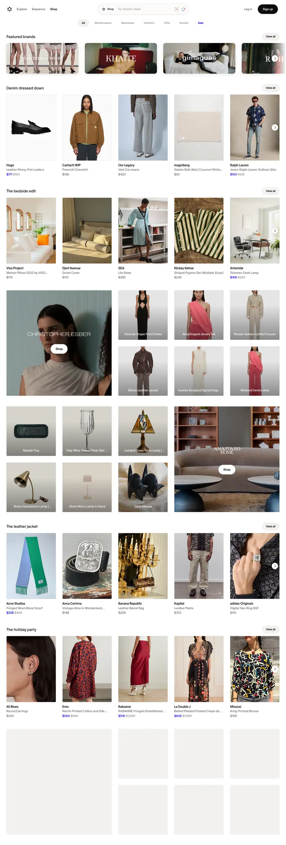
Sections
1. Tabs

- Centred pill tabs: All, Womenswear, Menswear, Interiors, Gifts, Brands, and Sale in
#0700ff. "All" is active with a #f2f1f0 pill.
- The header search placeholder becomes product-led: "Try 'ceramic vases'".
2. Featured brands (y 173)

- A label (20px 400) plus a "View all" pill. Brand banner cards (363 × 154) show campaign photos with each brand's own logo in white: Paloma Wool, Khaite, Gimaguas, Róhe …
3. Curated shelves (y 431 →)
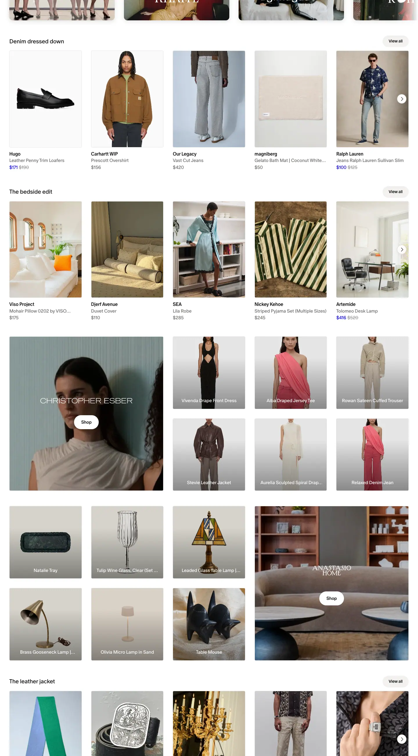
- Curation titles: "Denim dressed down", "The bedside edit", "The leather jacket", "The holiday party". Each shelf has 5 visible products + a chevron (the row scrolls to ≈13 products).
- Product: 248px image (radius 4px, studio backgrounds), brand (16px 500
#0d0d0d), name (16px 400 #6e6a69), price (16px). A sale price is #0700ff with the old price in #9a9796 (22 sale prices on the page).
- One shelf mixes an editorial promo: a tall portrait (≈530px wide) of a Christopher Esber look with the brand name and a white "Shop" pill, next to a 3 × 2 grid of products with white names on grey.
Why
- Edit names, not categories: "The bedside edit" is how a magazine sells products. It keeps Shop in the same voice as Sequence.
- Brands sell themselves: brand banners use each label's own logo and photography, so Cosmos stays neutral.
- The one colour is money:
#0700ff marks sale prices and the Sale tab. It is the only saturated UI colour on the site, so the eye finds deals instantly.
- 4px vs 3px: products get a slightly rounder corner than saved images. That is a quiet signal that this is a catalogue item.
Sequence hub · cosmos.so/sequence
Job: The front page of Cosmos's weekly newsletter on "culture, design, fashion, technology, and the internet". It plays the role a blog plays on other sites: SEO, brand voice, and a reason to come back weekly. The sitemap lists 38 editions and 153 stories (public pages).
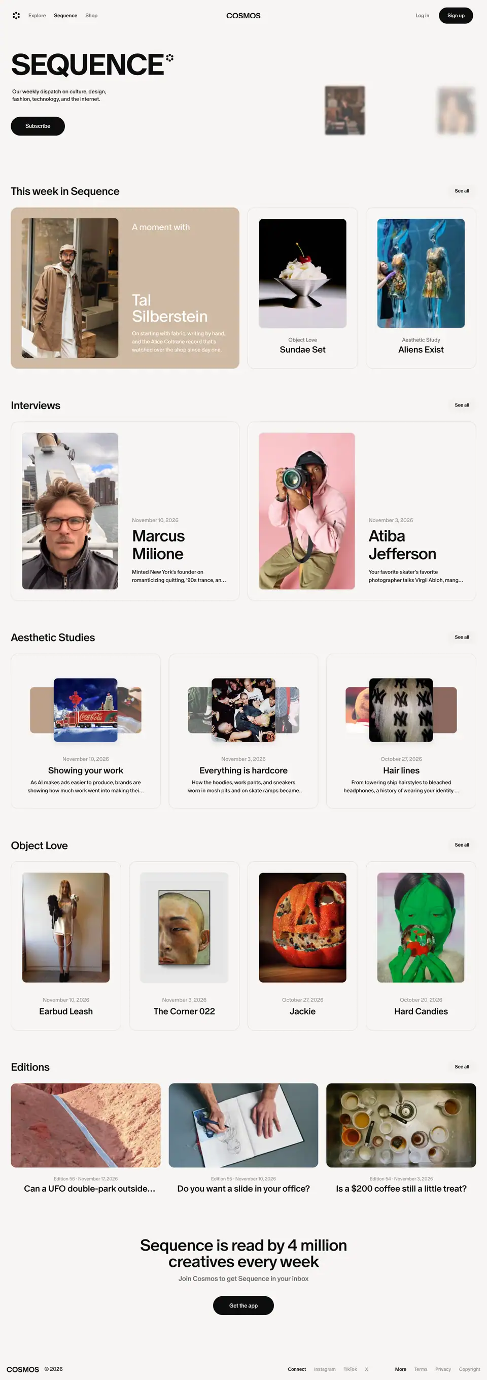
Sections
1. Masthead
SEQUENCE H1: 88 / 132px, 700, -4.4px, caps, with a small flower glyph. Below it: a 16px dek (296px wide) and a black "Subscribe" pill (160 × 56).- At right: 5 floating portrait thumbnails (117–183px) at staggered heights, some blurred. The
sequence-hero-strip-* keyframes swap their images with a blur-18px and scale-1.055 pulse.
- Background:
#f7f5f3 paper.
2. "This week in Sequence" (y 547)
- Row title 32px 500, with a "See all" secondary pill (84 × 40) at right.
- A light bento: one 676 × 477 tinted feature card ("A moment with Tal Silberstein") plus two 326 × 477 story cards ("Object Love · Sundae Set", "Aesthetic Study · Aliens Exist").
- Story cards: white, 0.5px ring, radius 20, inset image radius 12, centred category (16px
#6e6a69) and title (26px 500). Hover: #fcfbfa fill and image scale: 1.02 (0.3s).
3. Interviews, Aesthetic Studies, Object Love, Editions rows
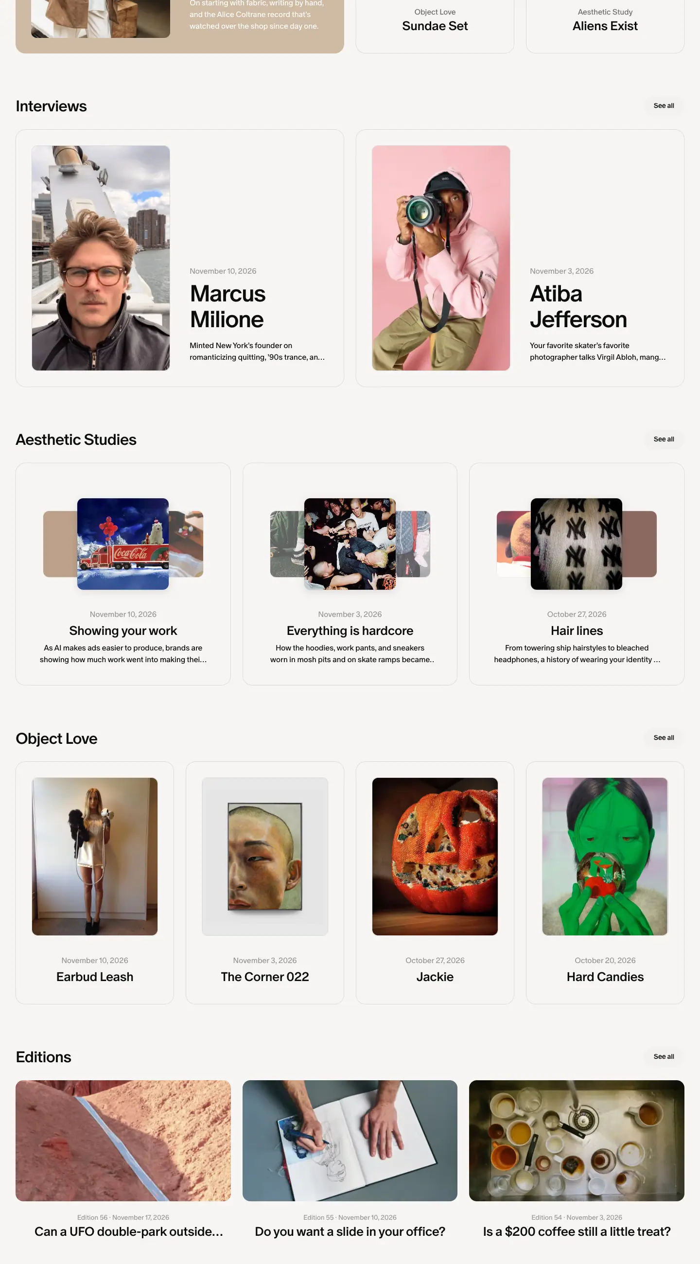
- The same row pattern repeats for each category. Interviews uses 2-up 676px cards with a portrait at left and a 48px name. The other rows use 4-up 326px cards.
4. Newsletter CTA + compact footer

- "Sequence is read by 4 million creatives every week" (48px 500, centred, 800px), "Join Cosmos to get Sequence in your inbox", and a pill.
Why
- A magazine inside the product: the nameplate, paper background and caps make Sequence feel like its own publication, which builds authority beyond "a SaaS blog".
- Rows by category: each row is a "section" of the magazine. "See all" links to the index pages.
- Image-tinted feature cards: each week's cover story gets its own colour automatically.
- A number as proof: "4 million creatives every week" is the only metric on the public site.
Mobile
The masthead scales to ≈56.5px. Rows become one-card carousels with a peek, and the Subscribe pill becomes full width with a "Download Cosmos" secondary pill under it.
Sequence indexes · /sequence/editions, /interviews, /aesthetic-studies, /object-love
All four indexes share one header and differ only in the grid.
| Index |
Full page |
Height |
Grid |
| Editions |
editions |
6,307px |
featured card + 3 columns of 443px |
| Interviews |
interviews |
15,346px |
2 columns of 676px cards |
| Aesthetic Studies |
studies |
9,147px |
4 columns of 326px |
| Object Love |
object love |
8,020px |
4 columns of 326px |
Shared header
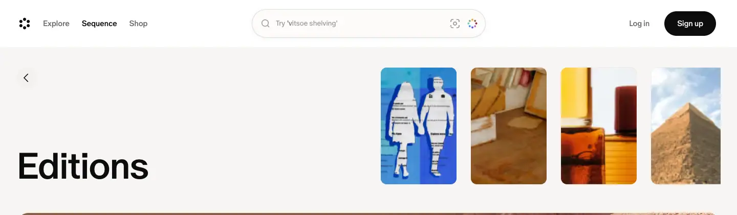
- A ≈40px back-chevron pill at x 32. Then an H1 at 72 / 72px, weight 500, -3%, at the bottom-left of a 228px block.
- Four thumbnails (≈92 × 128) at top-right preview the latest posts. On Interviews the fourth is blurred and faded.
- Why 500, not 700: the indexes are reading pages. A medium weight looks editorial; bold is kept for marketing and article titles.
Editions
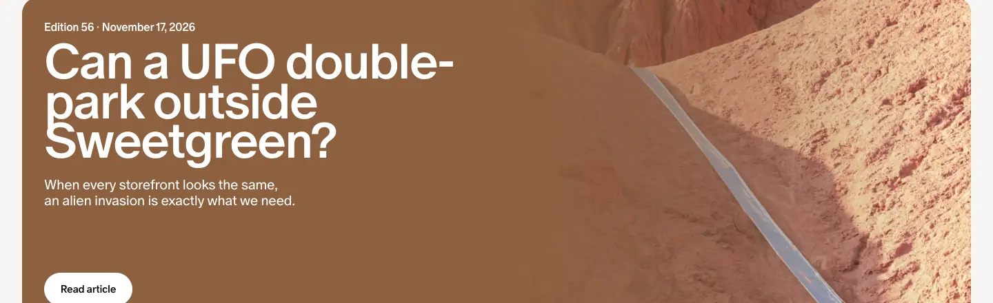
- Featured card: 1376 × 480, radius 24, a full photo, "Edition 56 · November 17, 2026", a 3-line title at 72 / 57.6px 500 white, a dek, and a white "Read article" pill.
- Grid: image tiles (radius 12) with "Edition 55 · November 10, 2026" (14px
#9a9796) and the question headline (26px 500), centred.
Interviews
- 676 × 530 white cards (0.5px ring, radius 20): a 283px portrait at left (radius 12), then date (14px grey), name 48 / 52.8px 500 (2 lines: first name / last name), and a 2-line dek clipped with an ellipsis.
- Why: The first name / last name split at 48px reads like a magazine contributor page.
Object Love and Aesthetic Studies
- 4 columns of 326px matted cards: 258px image, date, title (26px 500), centred.
- Object Love images are still lifes on single-colour backdrops. Aesthetic Studies images are photo collages.
Footer
Every index ends with the "Sequence is read by 4 million creatives every week" CTA and the compact footer.
Edition post template · /sequence/editions/
Captured: Can a UFO double-park outside Sweetgreen? (Edition 56, 18,788px) and Is a $200 coffee still a little treat? (13,539px).
An edition is the web version of one weekly email. It collects the week's whole newsletter into one long page.
Structure (Edition 56, measured)
| y |
Block |
Type |
| 132 |
Meta: "November 17, 2026 · Edition 56" |
20 / 23px 500 #6e6a69 |
| 163 |
Title: "Can a UFO double-park outside Sweetgreen?" (a <p>) |
48 / 48px 700 -3% |
| — |
Hairline divider |
— |
| 340 |
Internet Microdoses |
H3 32 / 35.2px 700 -0.64px |
| 2302 |
Aliens Exist (that week's Aesthetic Study, inline) |
H3 |
| 10557 |
Interview teaser: a tinted "A moment with Tal Silberstein" card |
32px 400 + 48px 400 white |
| 15525 |
Sundae Set (that week's Object Love) |
H3 |
| 16913 |
Quick Hits |
H3 |
| 17289 |
Community Question |
H3 |
| 18207 |
More from Sequence: 2 cards ("Do you want a slide in your office?", "Is a $200 coffee …") |
26px 500 |
| 18477 |
"Join Cosmos to get Sequence in your inbox" + pill |
20px 500 grey |
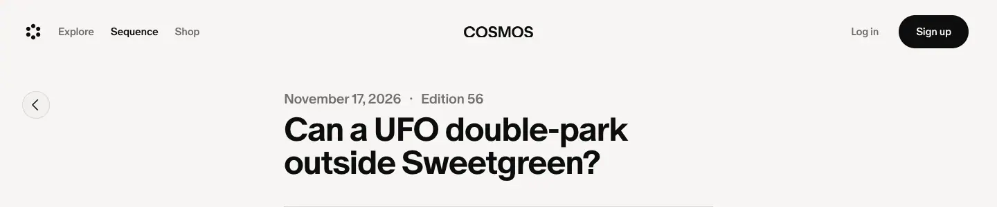
The microdose item
- A paragraph at 20 / 32px. The first sentence is bold (700) as a run-in head: "You can now bet on the art world. Kalshi, the prediction market, has teamed up with Artnet …".
- Then a grey 20px link with a → arrow: "Going once, going twice →".
- Images come in pairs at the column width (620px), radius 8, with 12px credits (
#6e6a69, 28px line height).
- 70 body paragraphs use exactly this style; 15 bold leads; 26 grey link lines (from the text-style histogram).
Interview teaser inside the edition
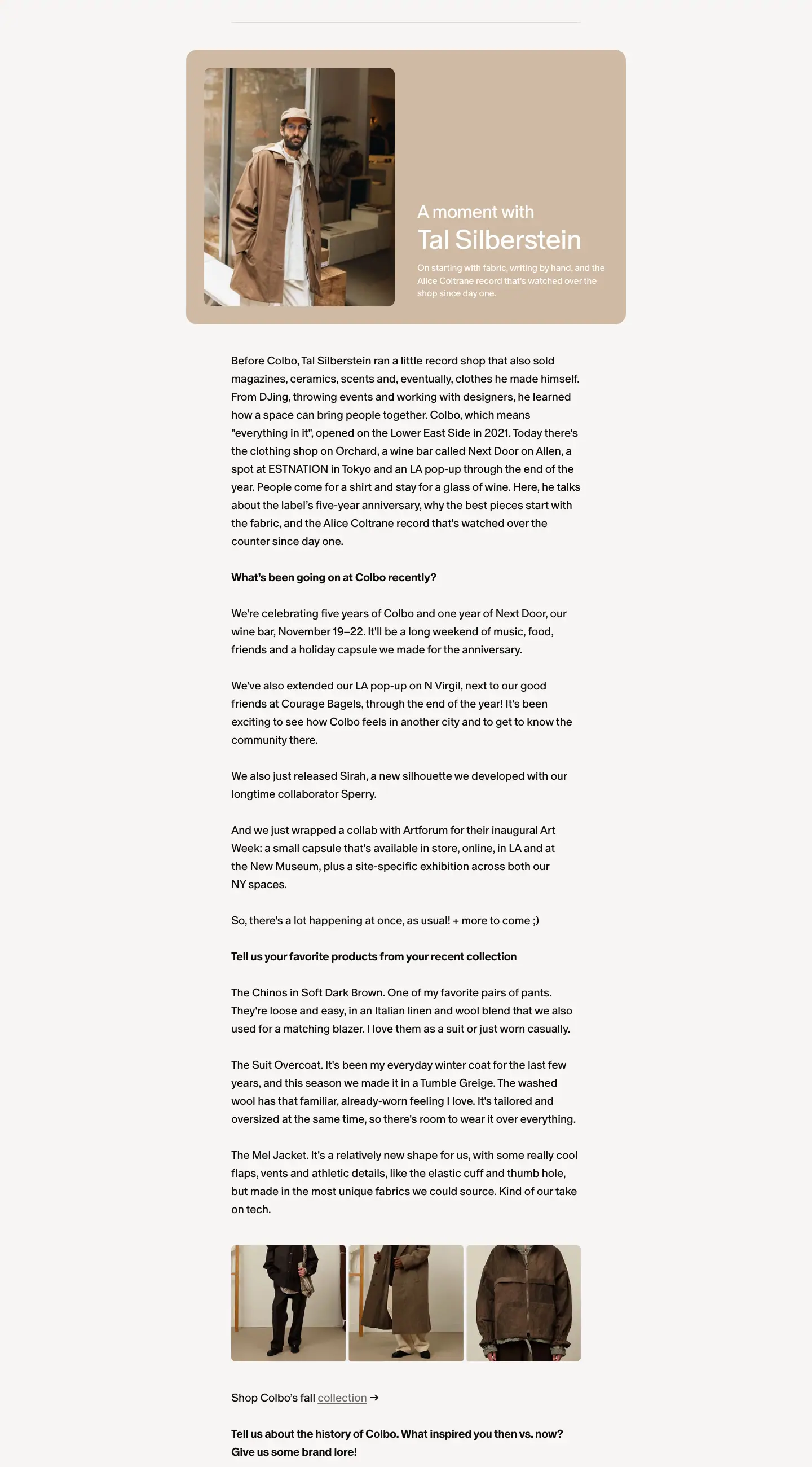
The same tinted card as the interview page hero, placed mid-newsletter as a "read the full interview" break.
Why this template works
- A newsletter has to be skimmable. Bold leads let a reader take in each story in one line, and grey pun links reward the curious.
- One 620px column matches an email's width, so the web and email versions read the same.
- Section heads at 32px 700 are the only bold headings on the page. They mark the newsletter's recurring segments (Microdoses, Quick Hits, Community Question), which build a weekly habit.
- Cross-links to all formats (a study, an interview, an object) make each edition the hub of that week's content.
Issues
- There is no
<h1>. The title is a <p>, and the outline starts at H3.
Story post templates · /sequence/
Three story formats share one URL pattern (/sequence/<slug>) and one header. They differ in how they open.
Shared parts
- Back button: a ≈40px round chevron at x 32, top-left.
- Column: 620px, centred (x 410).
- Meta: "November 17, 2026 · Object Love" at 20 / 23px 500
#6e6a69. The category name links to its index.
- Title: 48 / 48px 700 -3% (a
<p>). Dek: 14 / 19.6px #6e6a69. Then a hairline rule.
- Body: 20 / 32px 400, -0.4px. Links are underlined in
#6e6a69.
- End: "More from Sequence" (26px 500 title + 2 story cards), the 4-million CTA, and the compact footer.
Interview
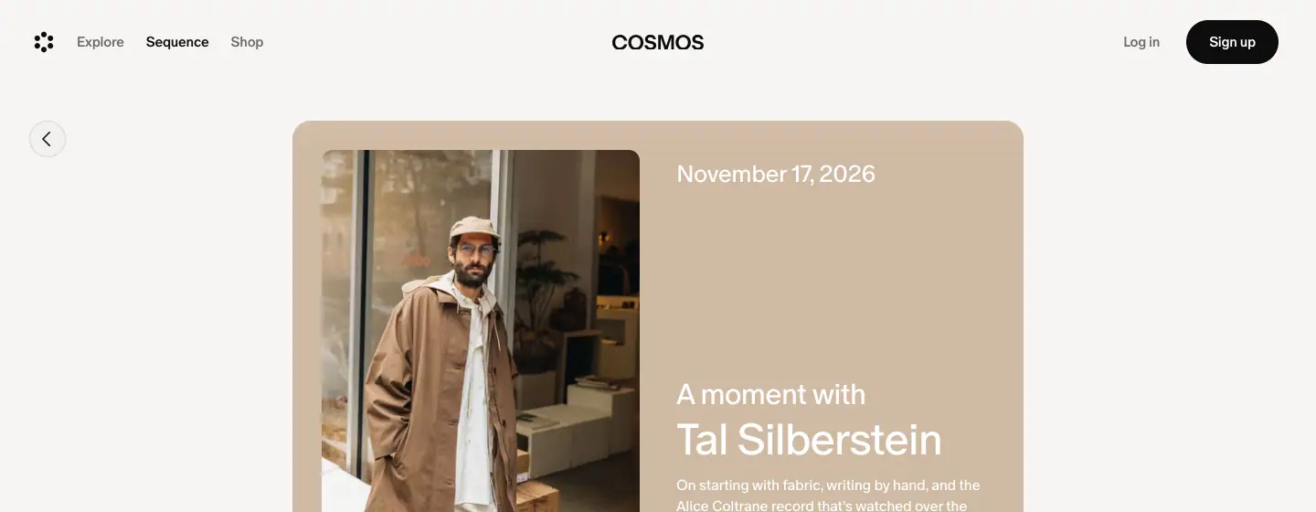
- Opens with the 800 × 500 tinted card (photo-sampled
rgb(207 186 163)): photo at left, "November 17, 2026", "A moment with", name 48px 400 white, and the dek.
- Body: an intro paragraph, then bold questions (20px 700) with regular answers. Product photos in a 3-up strip near the end. "Shop Colbo's fall collection →".
- Why: The tinted card is a cover. The Q&A keeps the subject's voice, as a magazine Q&A does.
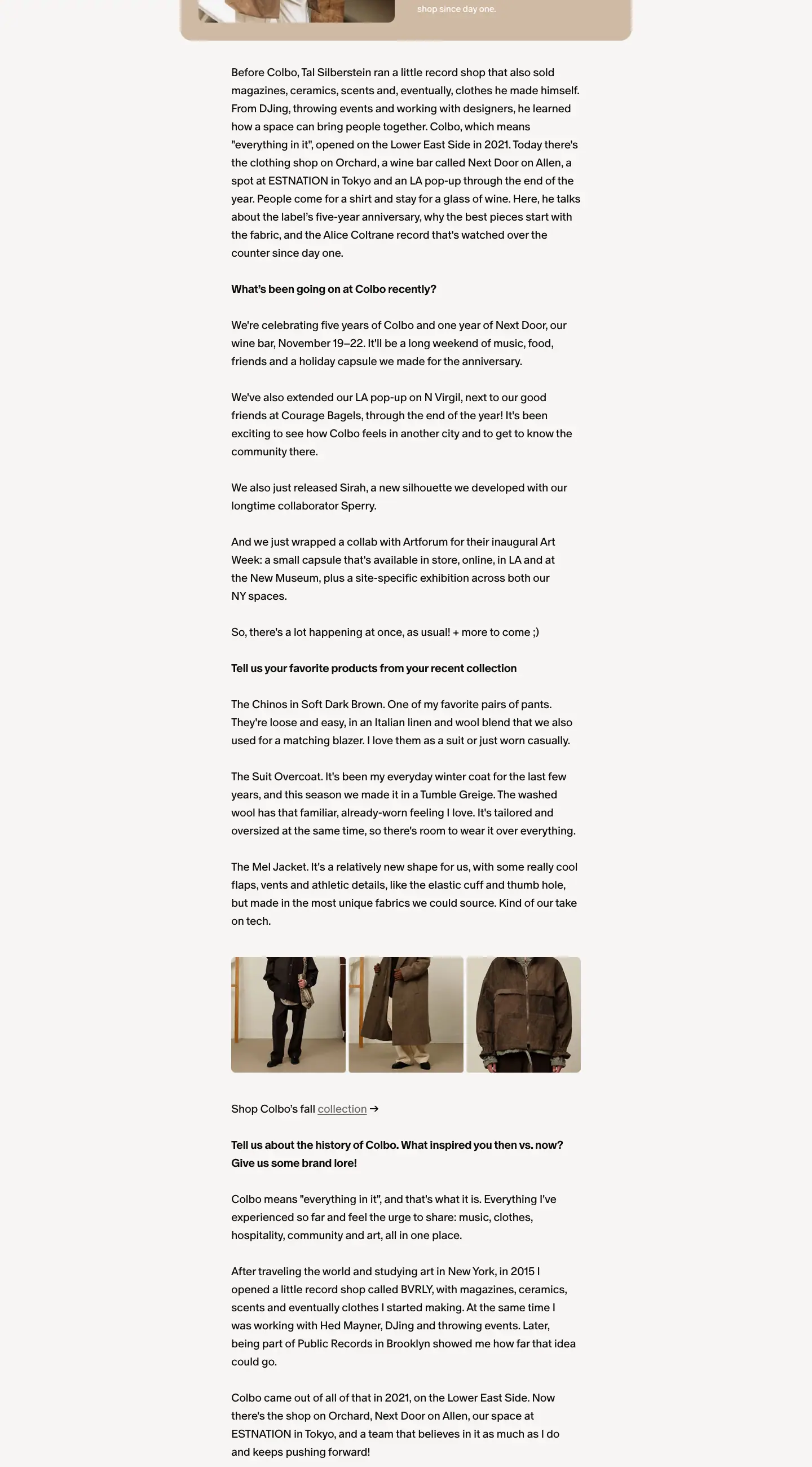
Object Love
- Title "Sundae Set", then one large studio photo (≈540px wide, radius 12, black seamless backdrop), then 2–3 short paragraphs and a price line with underlined product links ("Four cups cost $119, and four spoons are $70.").
- Why: One object, one photo, three paragraphs. The format is as minimal as the objects it covers.
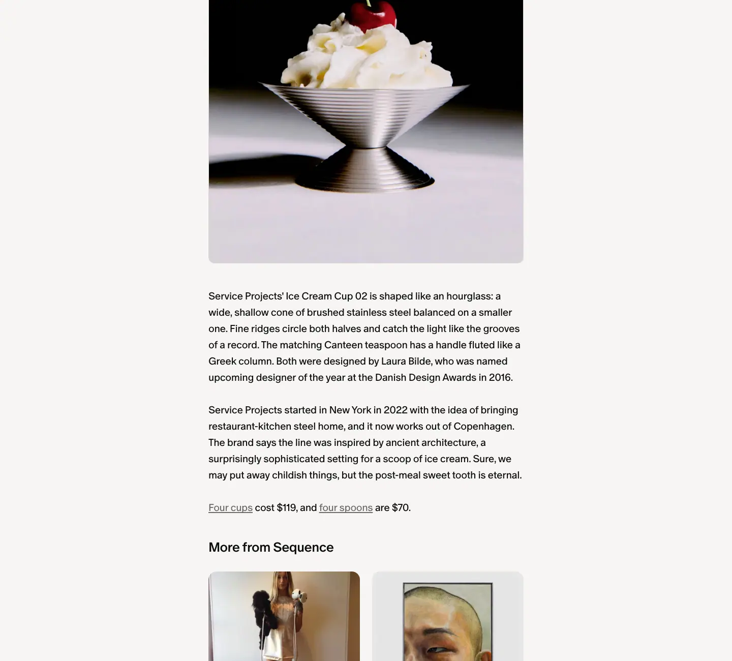
Aesthetic Study
- Opens with a fanned collage of 5 overlapping images, then an essay with inline photos (B&W fisheye skate shots, album covers) and a bulleted "further reading" list. It ends with a small "Everything is hardcore" collection card that links to the Cosmos collection behind the story.
- Why: An Aesthetic Study is a mood board turned into an essay. The opening collage is literally a Cosmos collection, which ties the editorial back to the product.
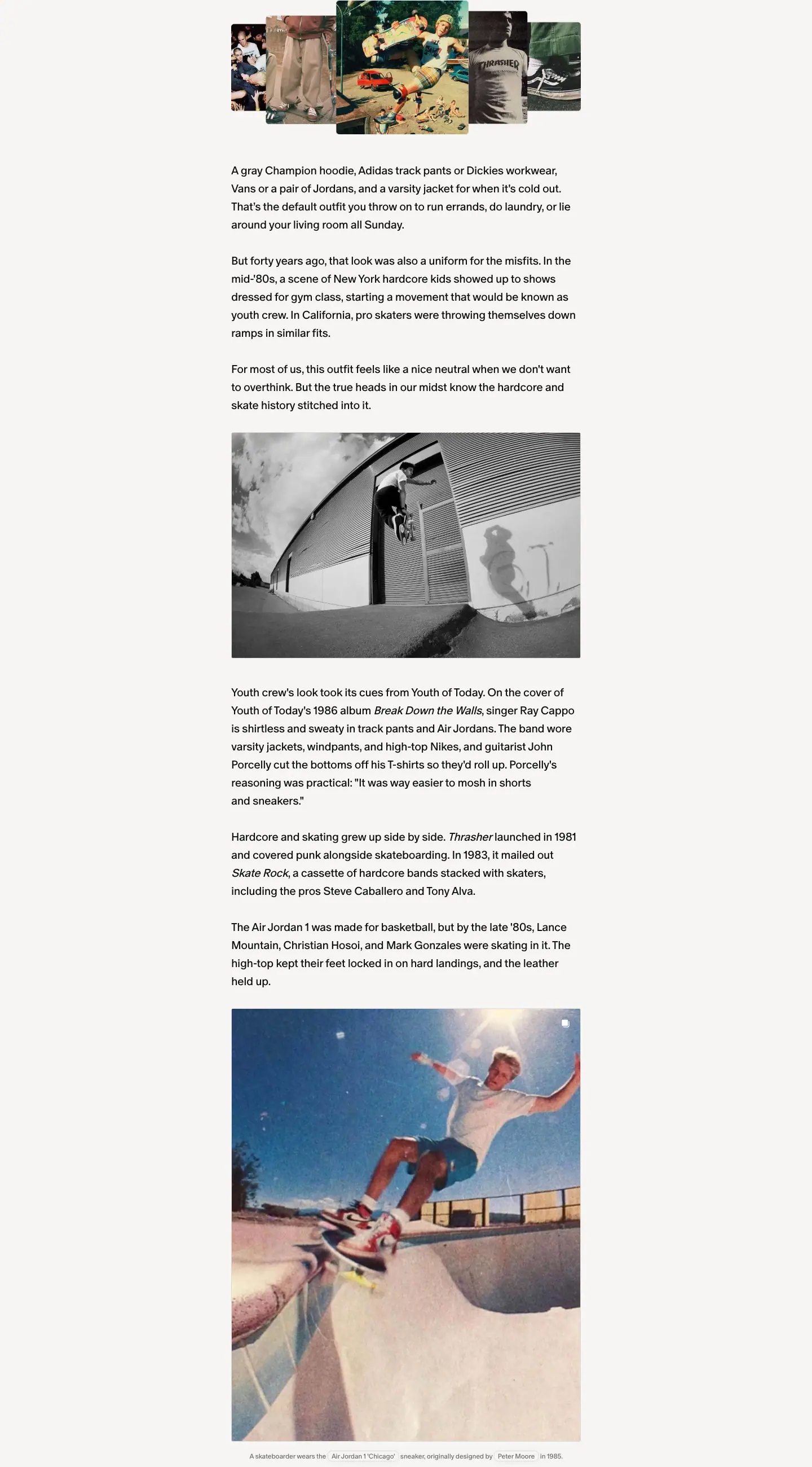
Mobile

The title stays at 48px and the tinted card becomes a full-width photo-then-text stack. The body stays 20 / 32px. Cosmos does not shrink the reading size on phones.
Brand storefront · /brand/
Captured: /brand/paloma-wool. The sitemap lists 452 brand storefronts (public pages).
Sections
1. Inset hero
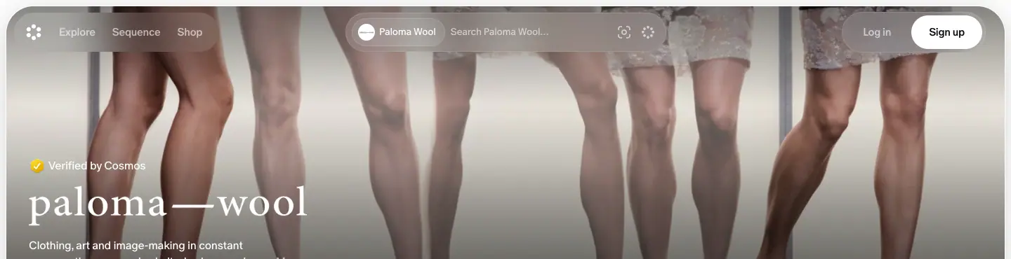
- A 1424 × 498 frame, 8px from the viewport edges, radius 40px,
overflow: clip. The brand's campaign photo fills it.
- Scrims:
rgba(0,0,0,.47) → transparent from the top (under the header), and transparent → rgba(0,0,0,.3) at the bottom (under the text).
- The header turns transparent with white links and the search pill scoped to the brand ("Search Paloma Wool…" in
#040404 at 60%).
- Content, bottom-left: a "Verified by Cosmos" badge (16px white), the brand's own logo lockup, a 2-line description with "…More", and a white "Follow" pill.
2. Filters and product grid
- Filter pills "Gender ⌄", "Price ⌄", "In stock", "On sale" at left and "Sort ⌄" at right (15 / 18px 500).
- 5 columns of 248px product images (radius 4px). Each has 3 lines: product name "No 2896 / Napoli Ballerine" (16px 500), brand (16px
#6e6a69), price (16px #6e6a69).
3. Sign-up wall
After ≈2–3 screens of scrolling, a "See more from @brand" modal appears over a blurred page with a sign-up action. The capture stops before that point.
Why
- The inset 40px hero looks like an app card, not a website banner. It gives fashion labels a premium "space" inside Cosmos.
- The brand's own logo and photo make the page feel owned by the brand, which matters when Cosmos asks labels to list their products.
- A strict grid with plain text keeps 452 very different brands looking consistent.
- The soft gate lets search engines index the page and visitors sample it, then asks for an account.
Search results · /search/elements/
Captured: /search/elements/typefaces, the URL the home hero's "dream font" phrase links to.

Structure
- Header: the search pill shows the query "typefaces", with a clear (×) button and image-search and visual-search buttons.
- Title row: "typefaces" in 20px 400 at left. A segmented control at centre: Elements (active,
#f2f1f0 pill), Products, Collections. Sort and filter icon buttons at right.
- Results: the 5-column masonry (248px, ≈33.5px gaps, radius 3px). Here it becomes a wall of type specimens, posters and alphabets: RONSARD, Clear, Unimark, A24, FOSS Modern Bold, BATUTA …
- Wall: after ≈2–3 screens, a sign-up modal ("Keep exploring 'typefaces'") appears over a blurred grid.
Why
- Search pages are SEO landing pages. Each query URL is a shareable, indexable mood board. The hero rotation sends visitors to these pages.
- Elements / Products / Collections follow the three things Cosmos stores: single images, shoppable items and curated sets.
- No UI decoration: the results are the page. On a typeface query the grid itself becomes a typographic poster.
Public Work · /public-work
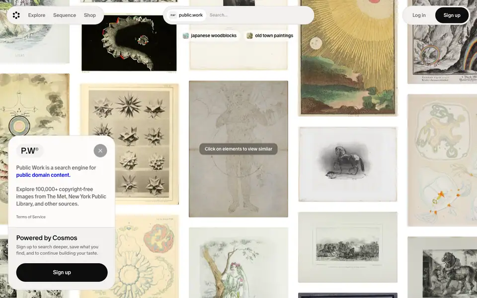
Job: A free sub-product: "a visual search engine for public domain content. Explore 100,000+ copyright-free images from The MET, New York Public Library, and other sources" (meta description). It acts as a top-of-funnel tool for designers.
Structure
- A full-viewport canvas (900px tall, no page scroll) of public-domain scans: engravings, botanical plates, star charts, tile patterns, animal prints. It enters with
canvas-enter: blur 20px + scale 0.8 → sharp, 1.8s, cubic-bezier(.16,1,.3,1).
- A floating header inside a pill bar: "public work" search chips with suggestions ("japanese woodblocks", "old town paintings").
- A hint pill over an image: "Click on elements to view similar".
- The info popover at left (≈368px wide, white, rounded):
- "P.W°" monogram, close button
- "Public Work is a search engine for public domain content." (the link is in
#0700ff)
- "Explore 100,000+ copyright-free images from The Met, New York Public Library, and other sources."
- "Terms of Service"
- A grey "Powered by Cosmos" box: "Sign up to search deeper, save what you find, and to continue building your taste."
- A full-width black "Sign up" pill
Why
- A free, useful tool builds goodwill and backlinks. Public-domain art is a strong SEO topic for designers.
- It reuses the core product (visual similarity) on safe content.
- "Powered by Cosmos" puts the brand in the background, like a sponsor, so the tool feels generous rather than salesy.
- The 1.8s blur-in is the slowest motion on the site and suits a "museum" entrance.
Careers · /careers
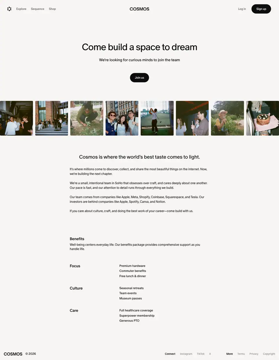
A short page (1,859px) on #f7f5f3 paper.
Sections
| y |
Block |
Measured |
| 220 |
Title "Come build a space to dream" |
48 / 45.6px, 400, -1.92px, centred (≈595px block) |
| — |
Subline "We're looking for curious minds to join the team" |
20 / 23px 400 |
| 377 |
"Join us" pill |
97 × 48 black pill |
| ≈480 |
Team photo strip |
8 candid photos, full bleed |
| 796 |
Statement "Cosmos is where the world's best taste comes to light." |
26 / 29.9px 400, centred, 624px |
| — |
4 short paragraphs |
16 / 24px, 350 (Book), 720px column |
| 1222 |
"Benefits" + intro |
20px 500, 720px column |
| 1362 |
Focus / Culture / Care |
label column 240px (20px 500), values 16px |
| 1816 |
Compact footer |
COSMOS © 2026, Connect, More |
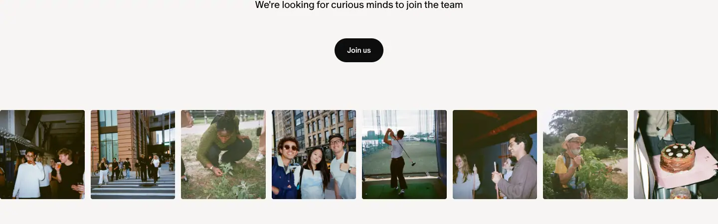
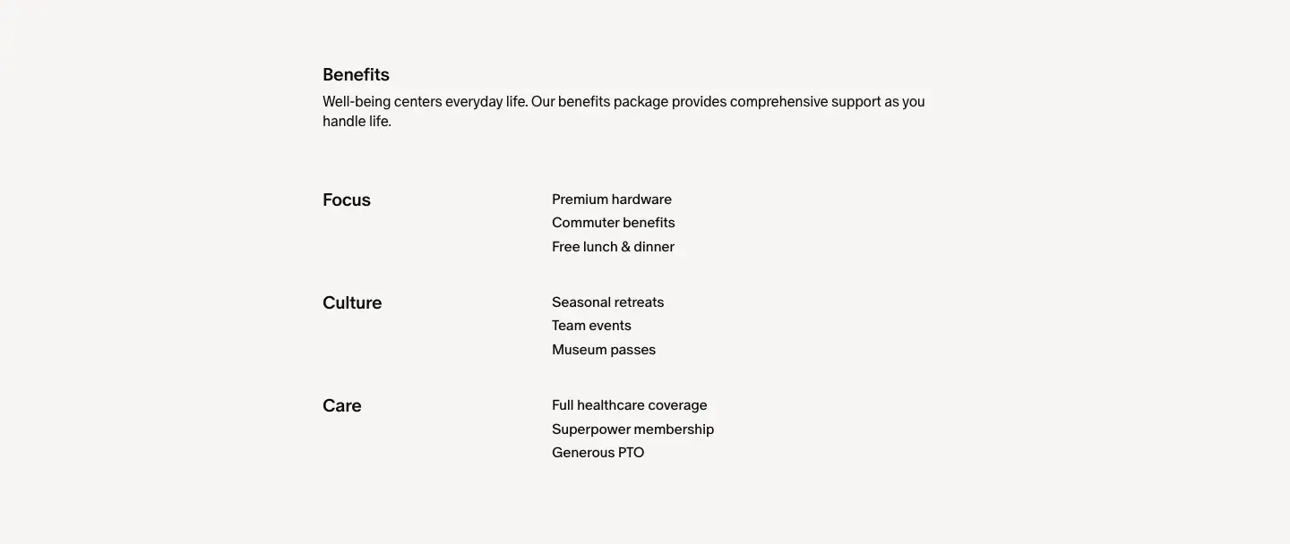
Why
- Weight 400 for the title makes the page feel personal and calm, not a recruiting ad.
- Real team photos (a birthday cake, the office, team outings) show the culture instead of describing it.
- Benefits as a 3-line definition list under Focus / Culture / Care: the categories are values, the items are concrete ("Museum passes", "Superpower membership").
- No job list on the page. "Join us" is the only action; the openings live elsewhere (not captured).
Legal · /legal/terms-conditions (also /legal/privacy-policy, /legal/copyright-policy)

Structure
| Element |
Measured |
| Column |
720px, centred (x 360), on #f7f5f3 paper |
| H1 "Terms & Conditions" |
48 / 48px, 400, -3% |
| "Last updated: September 25, 2025" |
16 / 22.4px #6e6a69 |
| Clause heads "1. Agreement to Terms" |
20 / 23px 600, -0.4px |
| Body |
16 / 24px, 350 (Book), -0.32px; 47 paragraphs |
| Run-in sub-clauses "(A) Posting Content." |
16px 600 (23 instances) |
| Arbitration notice |
a whole paragraph in 600 |
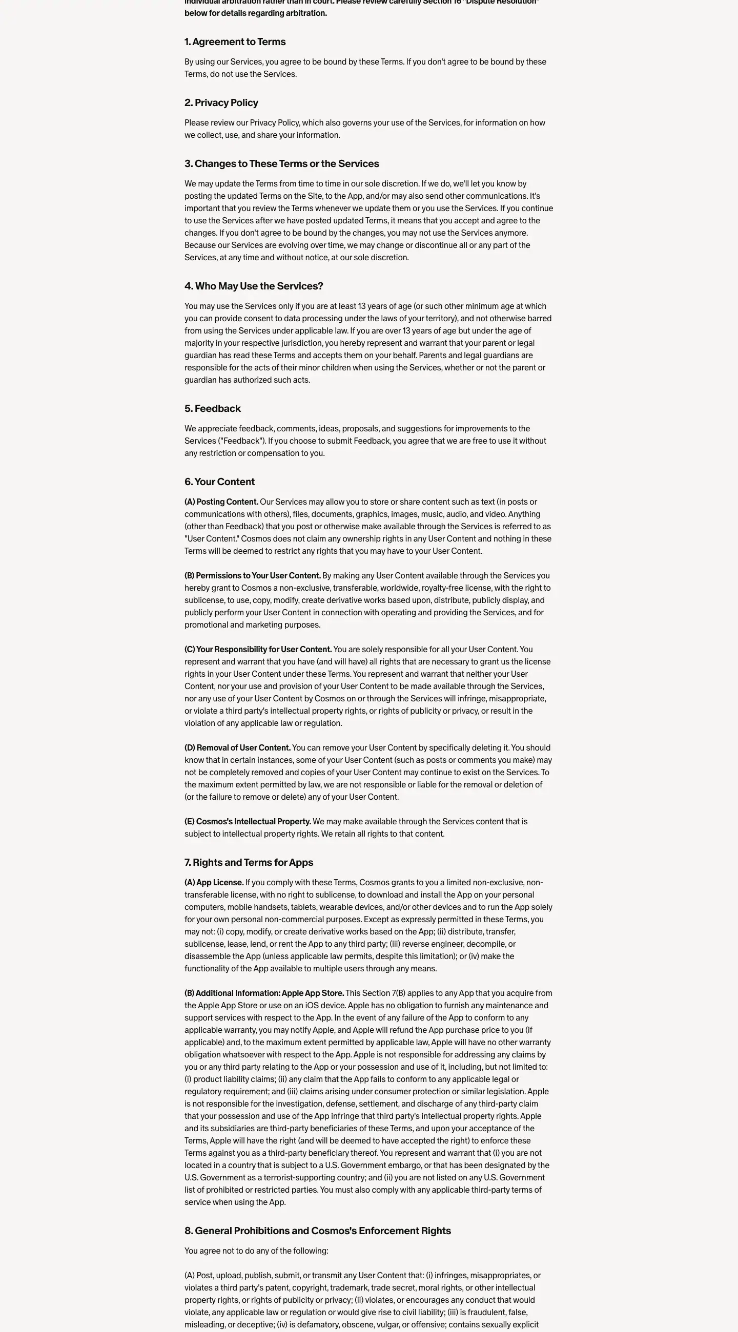
Why
- Book weight (350) makes 8,000px of dense text look lighter.
- The same paper and column as the editorial pages keep even legal text "in brand".
- The bold arbitration notice is the one part users must not miss, and it is the only full-bold paragraph.
404 · Content not found
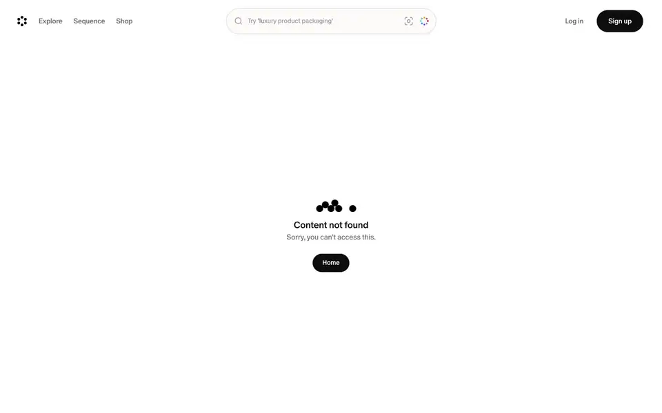
Captured at /changelog. The same template renders for /blog, /pricing, /about, /press, /premium and any unknown path. All of them return HTTP 200, because Cosmos treats /<anything> as a possible username.
Structure
| Element |
Measured |
| Header |
the product header, with the search pill ("Try 'luxury product packaging'") |
| Mark |
5 black dots: a group of four plus one apart |
| H1 "Content not found" |
20 / 23px 500, centred |
| "Sorry, you can't access this." |
16 / 22.4px #6e6a69 |
| "Home" |
80 × 40 black pill, 14px 500 |
| Position |
centred in the 900px viewport, at y ≈ 479 |
Why
- The dot mark is the logo broken apart, a gentle visual pun for "something's missing".
- The search stays in the header, so a lost visitor can search right away.
- One action: "Home".
SEO note
A soft 404 (status 200 for missing pages) can let search engines index empty pages. A copy of this design should return 404 for unknown non-username paths.